Index
Re: Stock campaign
Roles: Art Direction, Design, Motion Direction
Client: Designed in-house for Storyblocks
Team: Creative direction by Kaitlyn Rossi, naming & messaging by Valerie Shore, campaign video by Kyle Miller, site build by Tony Gugliotta
Identity design for a film initiative
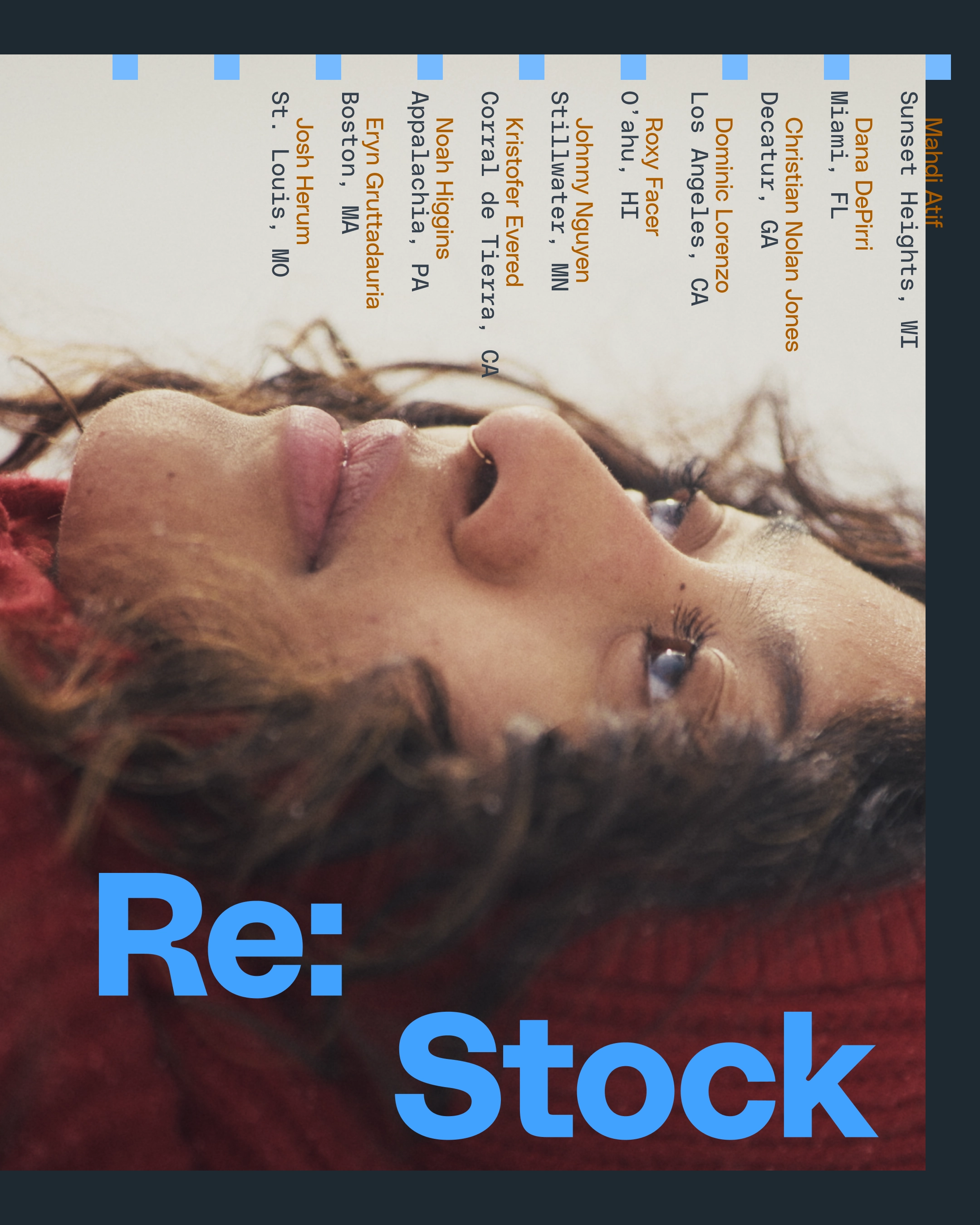
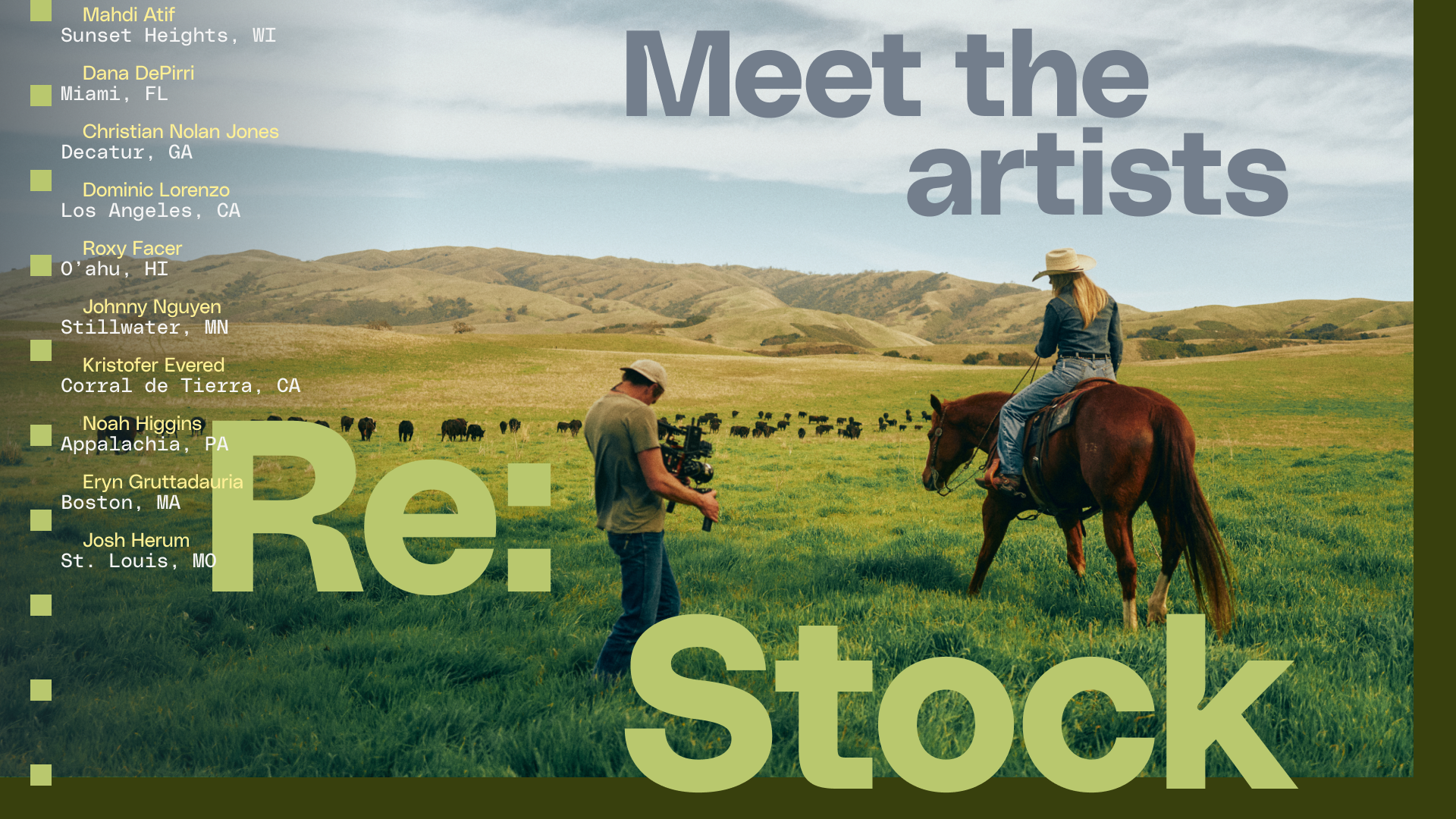
Re: Stock is an initiative by Storyblocks to improve the quality of stock footage. This iteration of Re: Stock commissioned 10 filmmakers to create footage collections that highlight their communities.
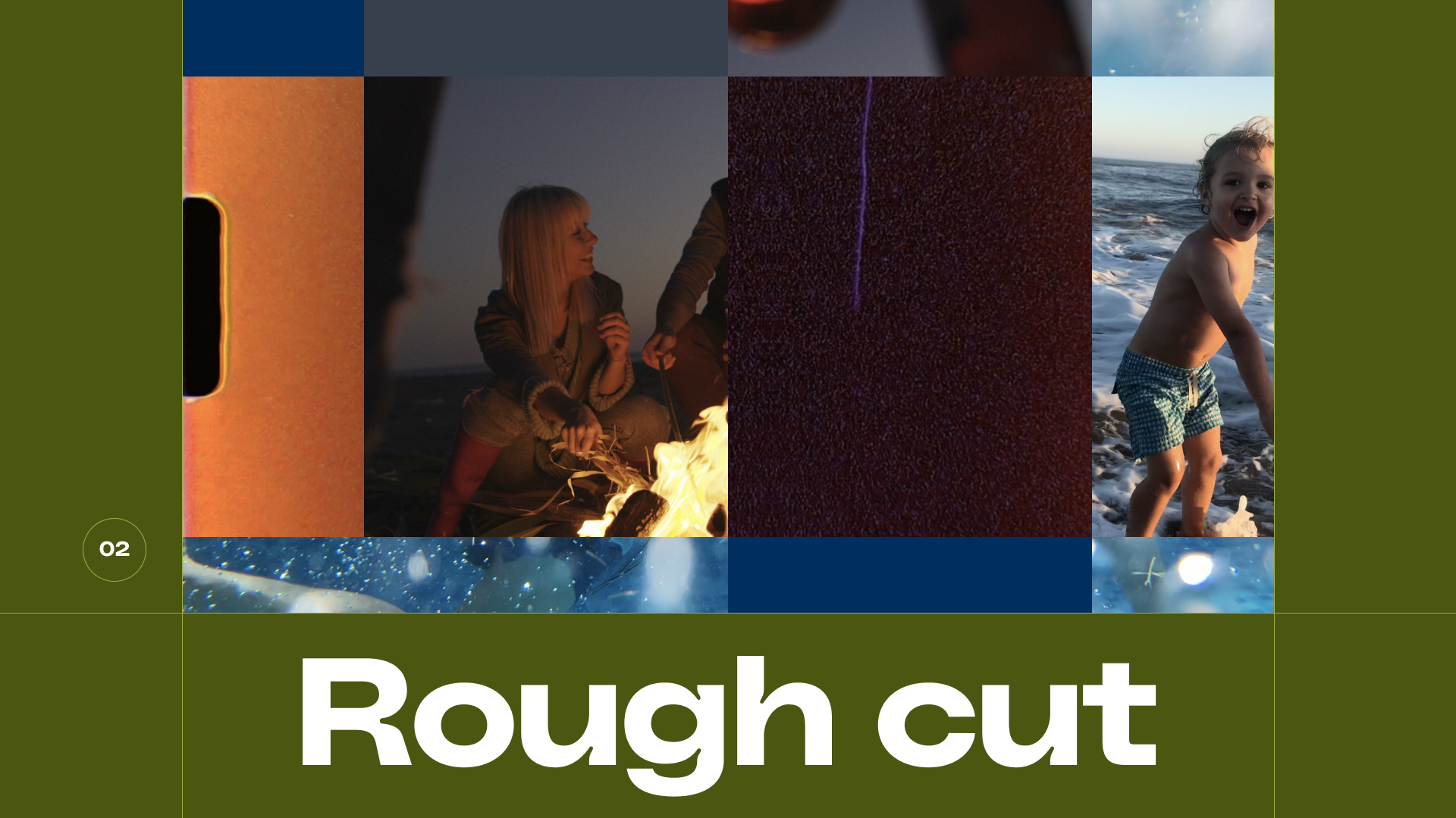
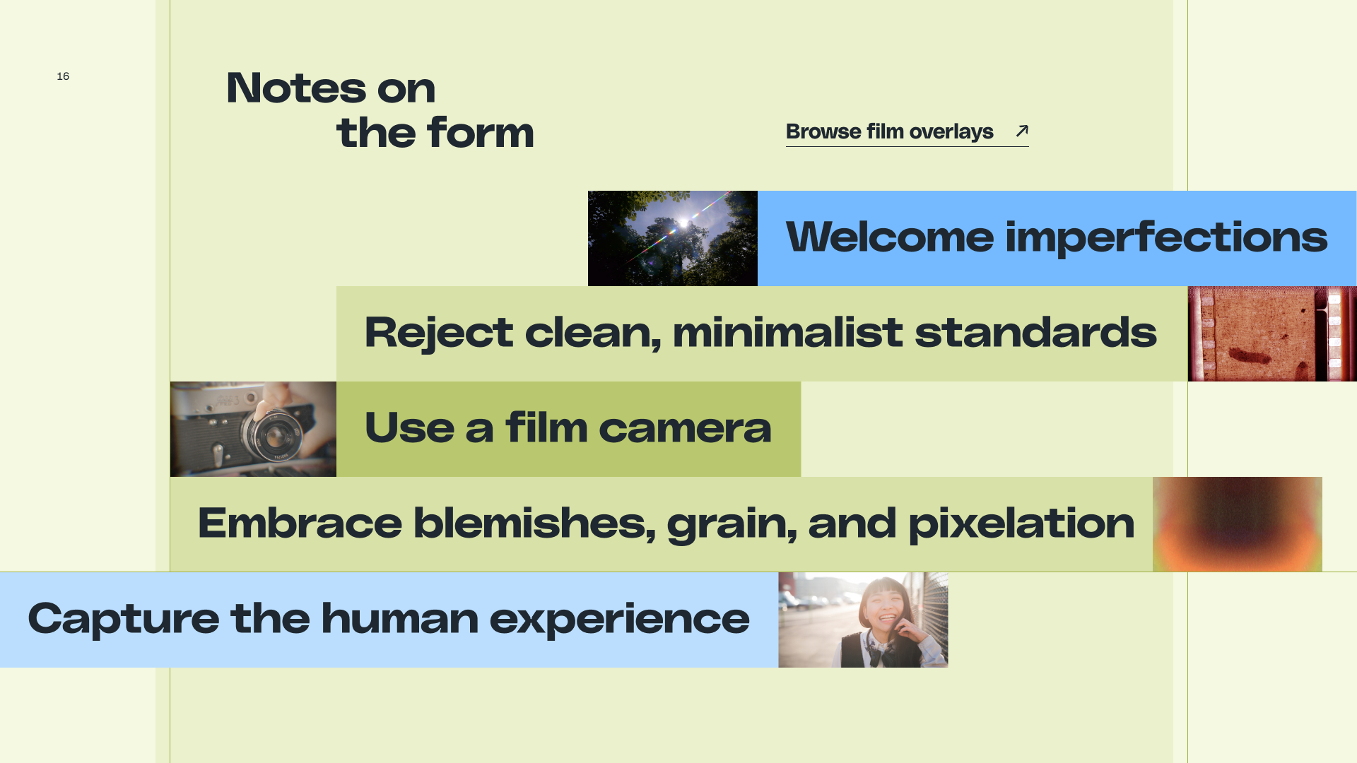
The campaign’s visual language uses simple motifs: Squares, tabs, and frames. These motifs can be combined in many different iterations, creating flexibility for a wide range of materials: Videos, social posts, blog headers, a webinar, longform guide, and merch.
Visual motifs play with the conventions of film:
The colon in “Re:” was another point of inspiration: As punctuation, the colon signals a break or pause, a chance to reconsider and reply to the clichés behind traditional stock media and its lack of authentic representation. The PolySans colon features square forms that are repeated as a pattern across designs. Squares are also used to divide space in underlying grids.



When Something Solid Collapses
Roles: Publication Design, Writing, Photography
Client: MFA thesis, School of the Art Institute of Chicago
I wrote and designed an apocalyptic novel
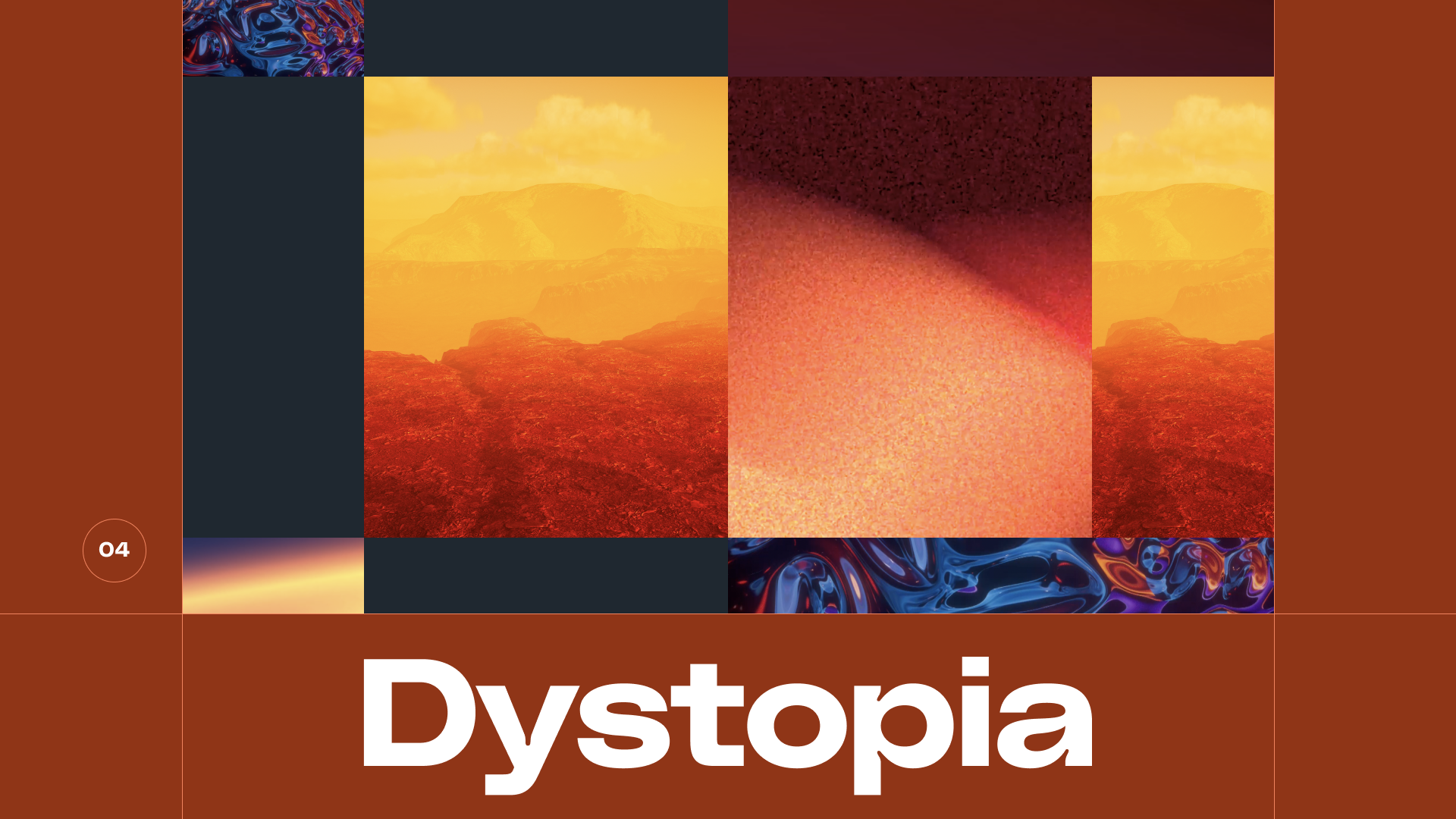
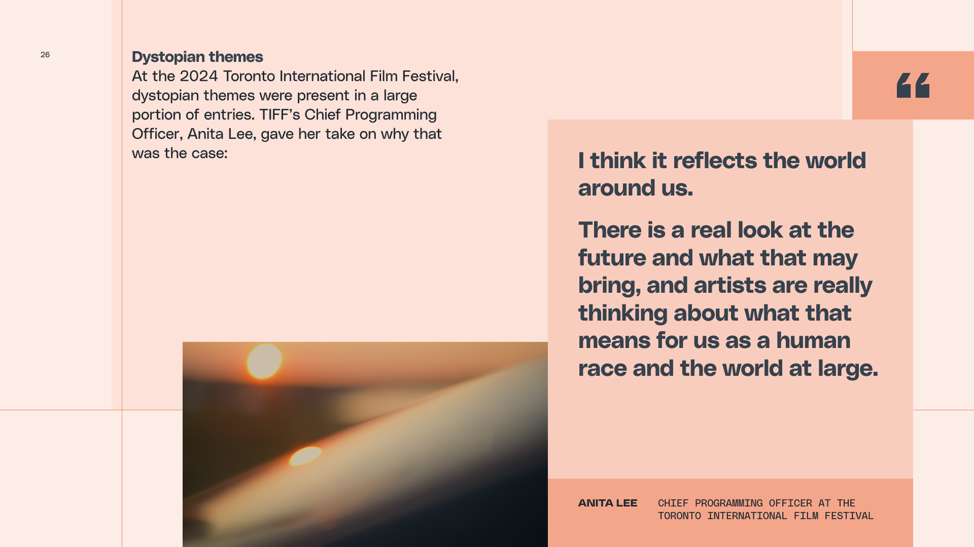
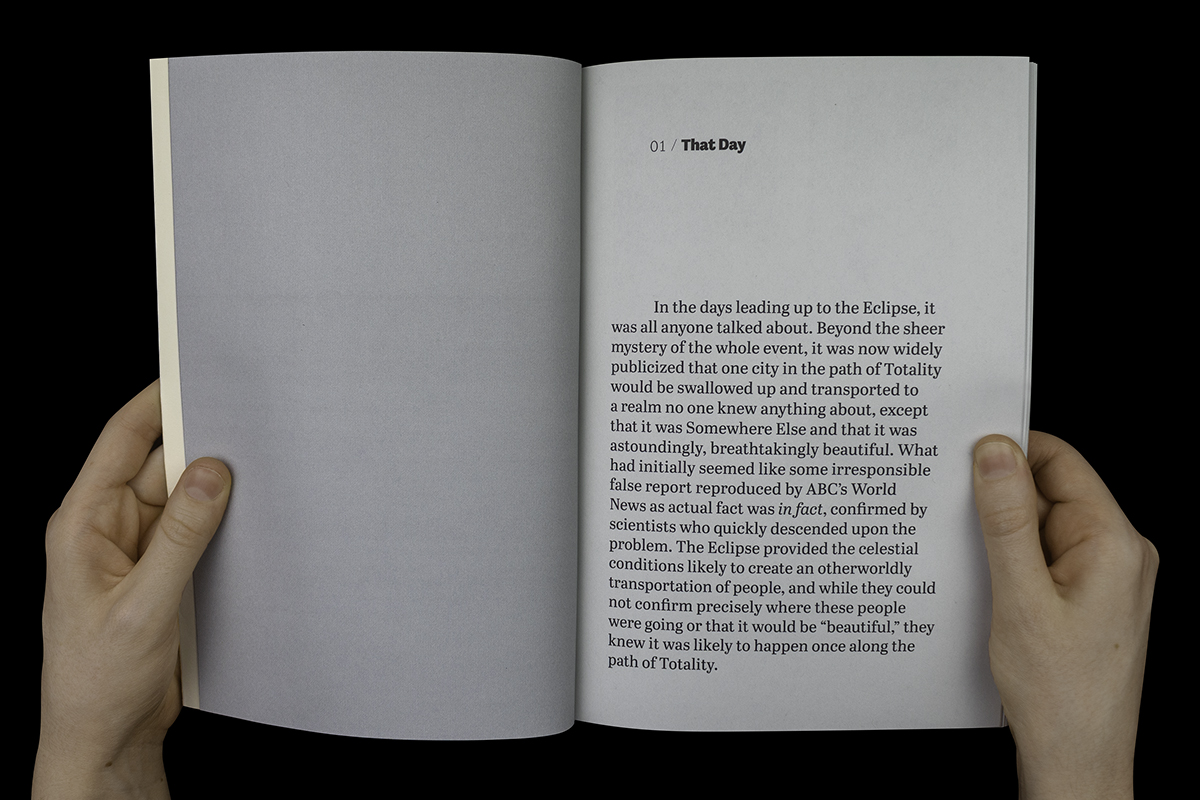
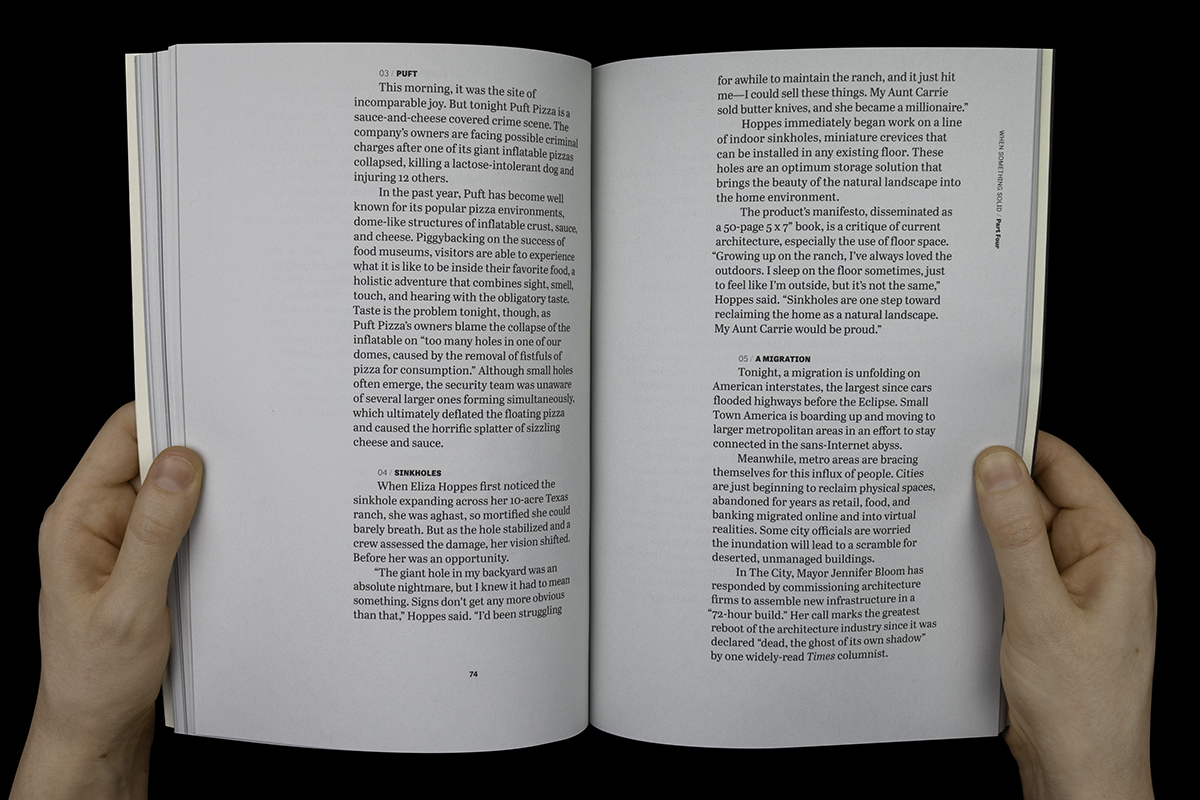
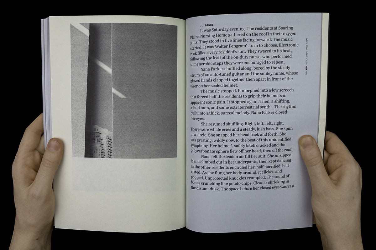
I wrote, photographed, and designed “When Something Solid Collapses Under Itself.” In five parts and 112 short stories, the novel crafts an absurdist, dystopian narrative. Stories cover topics ranging from the Great American Eclipse to a White House séance to one giant, inflatable pizza.
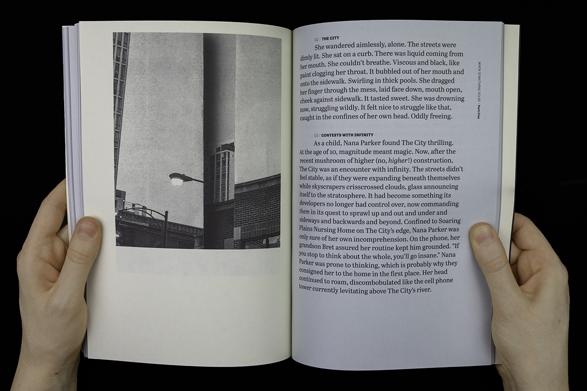
The book’s design uses one grid system and activates it differently based on the chapter. Parts 2 and 4 build a montage from stories that read as fragments or digressions. These parts use a shorter line length to drive a faster reading pace, reminiscent of film sequences that juxtapose many different shots over a short period of time. Parts 1, 3, and 5 each follow a specific narrative event and use a longer line length to emphasize continuity.
Photographs are inserted at key narrative moments and expand the imaginative possibilities of text.
The book was featured at a 2019 reading hosted by Long Day Press and Maudlin House.

A reading corner
Roles: Exhibition Design
Client: MFA thesis, School of the Art Institute of Chicago
Exhibition design and production
This exhibition at Sullivan Galleries showcases my novel. I designed its exhibition space as an open reading corner that reflects the book’s themes.
The space has three possible entry points. To draw viewers from each sightline, I enlarged photographs from the novel and positioned them across both available walls.
I mounted one photo at the intersection of two walls to take advantage of the corner architecture and reinforce ideas around vertiginous, folding cities.


The Age of the Artist
Roles: Art Direction, Design, Animation
Client: Designed in-house for Storyblocks
Team: Creative direction by Kaitlyn Rossi, writing by Valerie Shore, strategy by Gia Marando & Emilia Korte
Identity for a digital publication and campaign
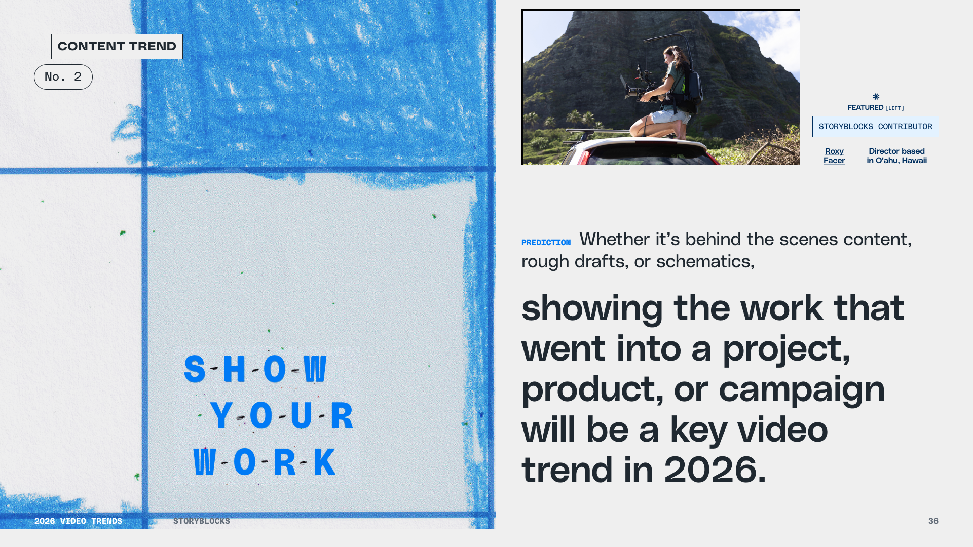
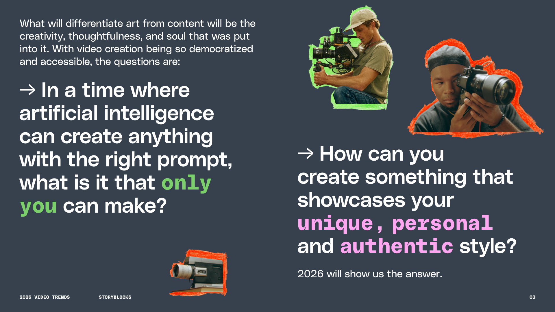
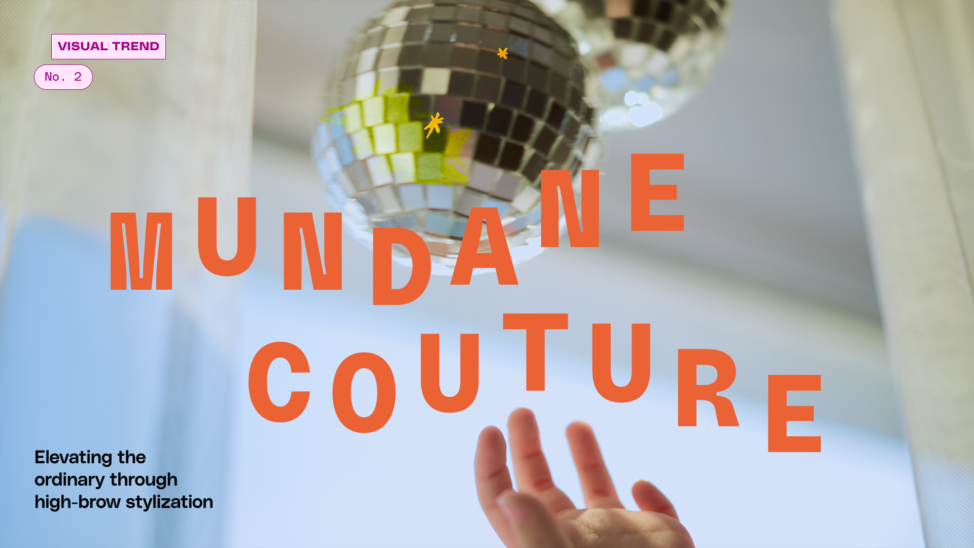
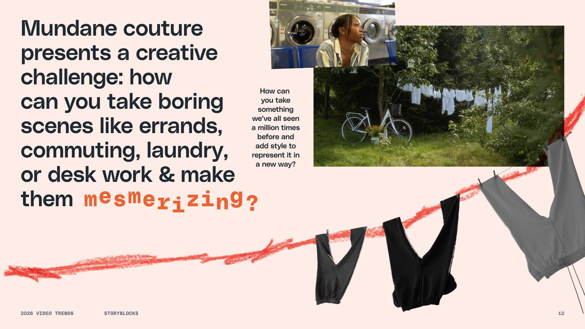
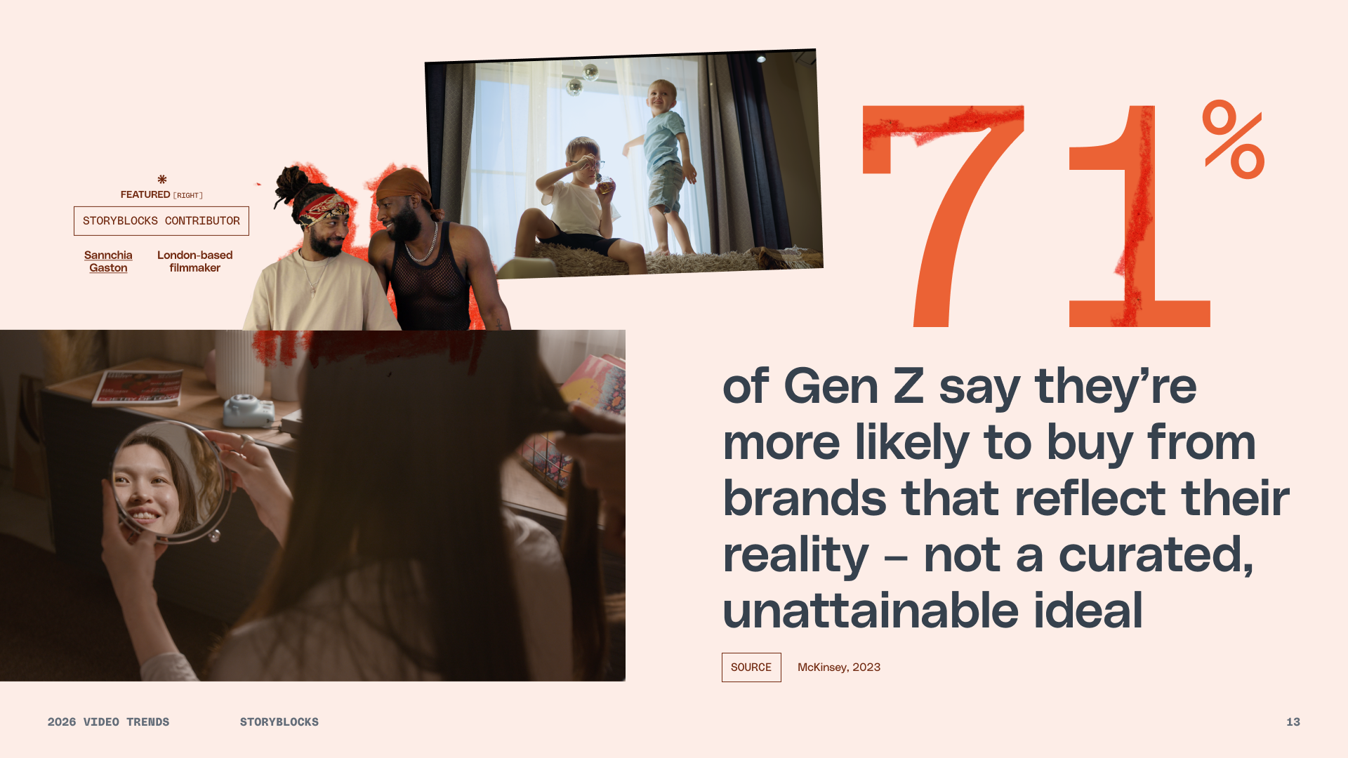
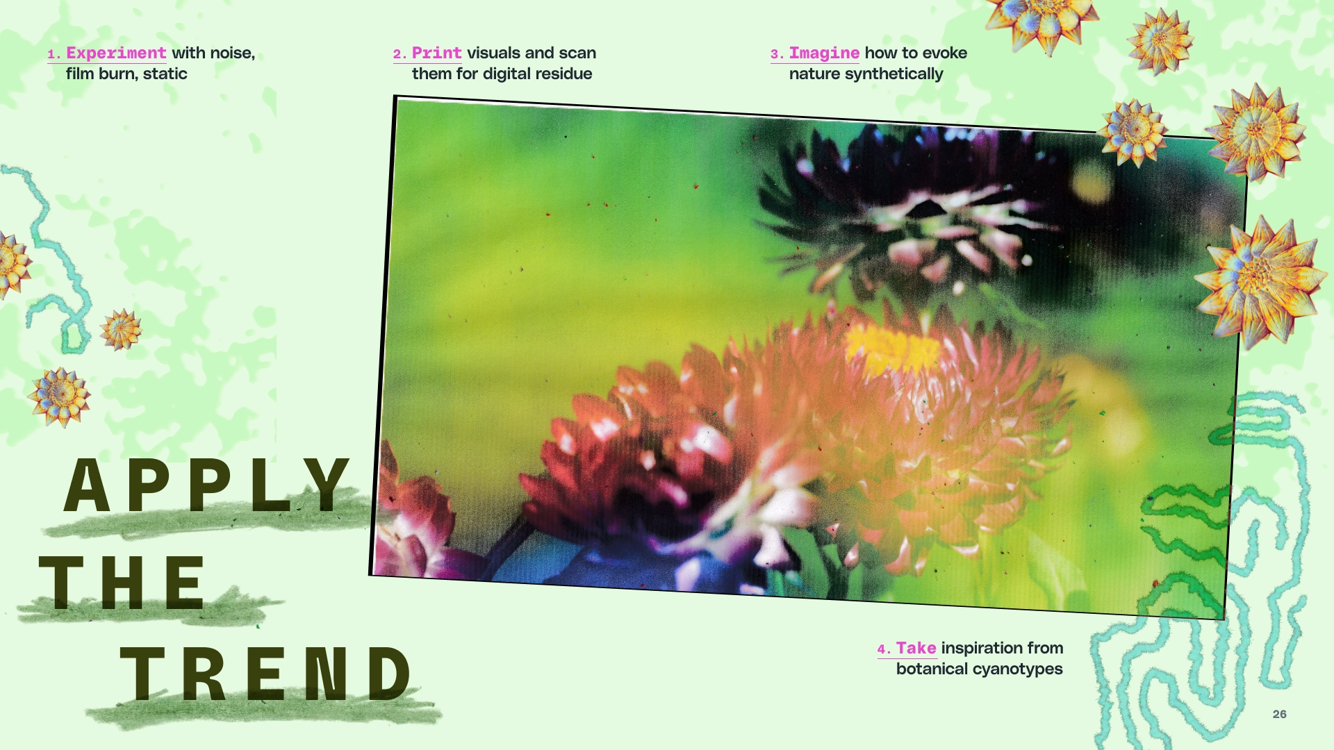
The Video Trends Guide unpacks the cultural forces shaping video and predicts how these forces will affect video creation in 2026. We took an optimistic stance: Audiences will value the craft behind thoughtful creative work more than ever, as an antidote to AI slop.
Inspired by this outlook, the guide’s visual language captures the joy of making at a time when making is getting flatter and faster. Cutouts, layering, and whimsical typography are all used to communicate that sense of delight.
These techniques also added joy to my design process. I rediscovered the joy of crayons, for example: A sense of spontaneity, physical connection, and childlike expression that has stuck with me.


The Complete Field Guide
Roles: Publication Design, Writing, Photography
Client: Self-initiated
Design, writing, and photography for an artist book
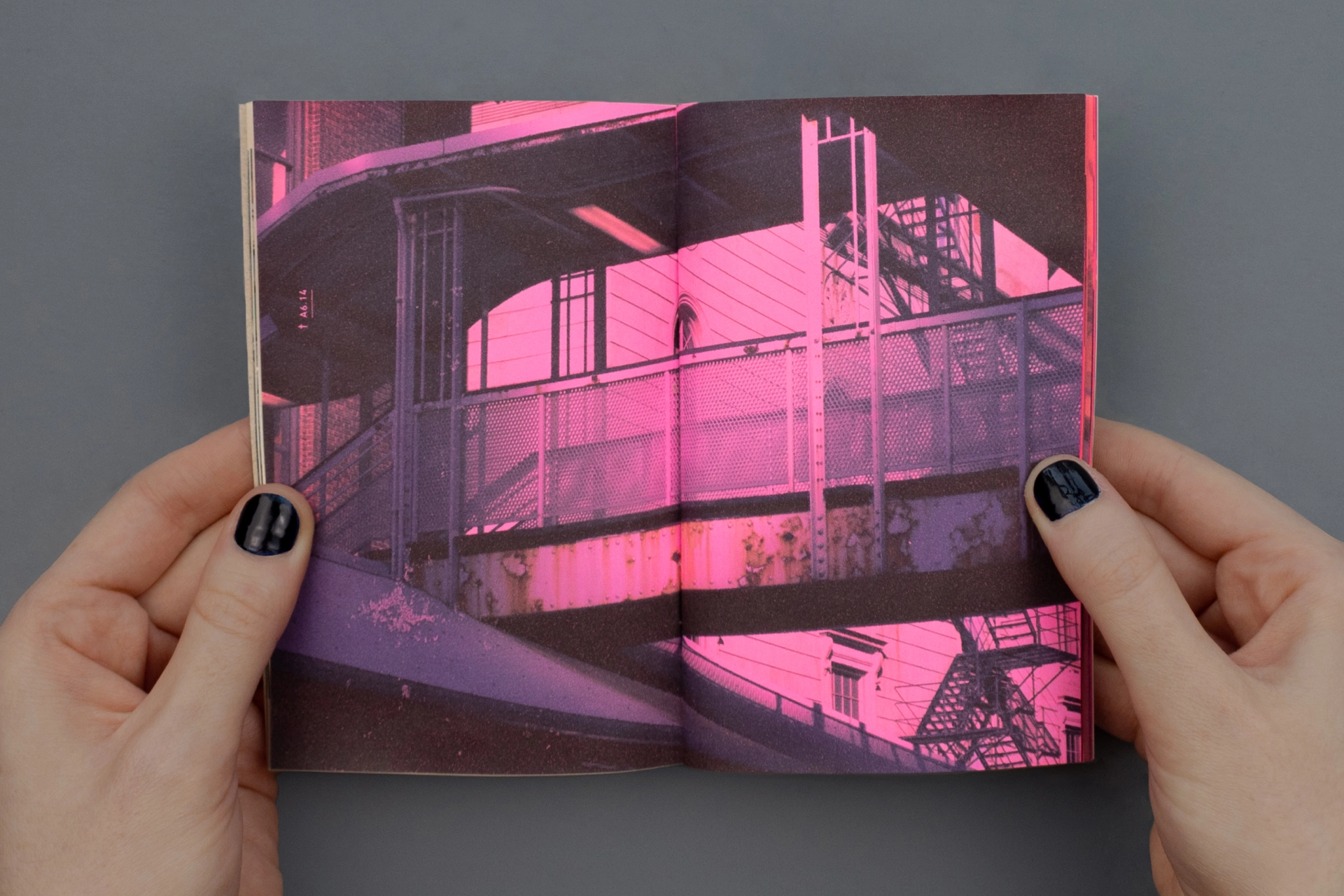
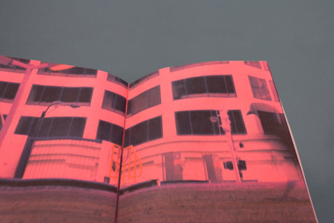
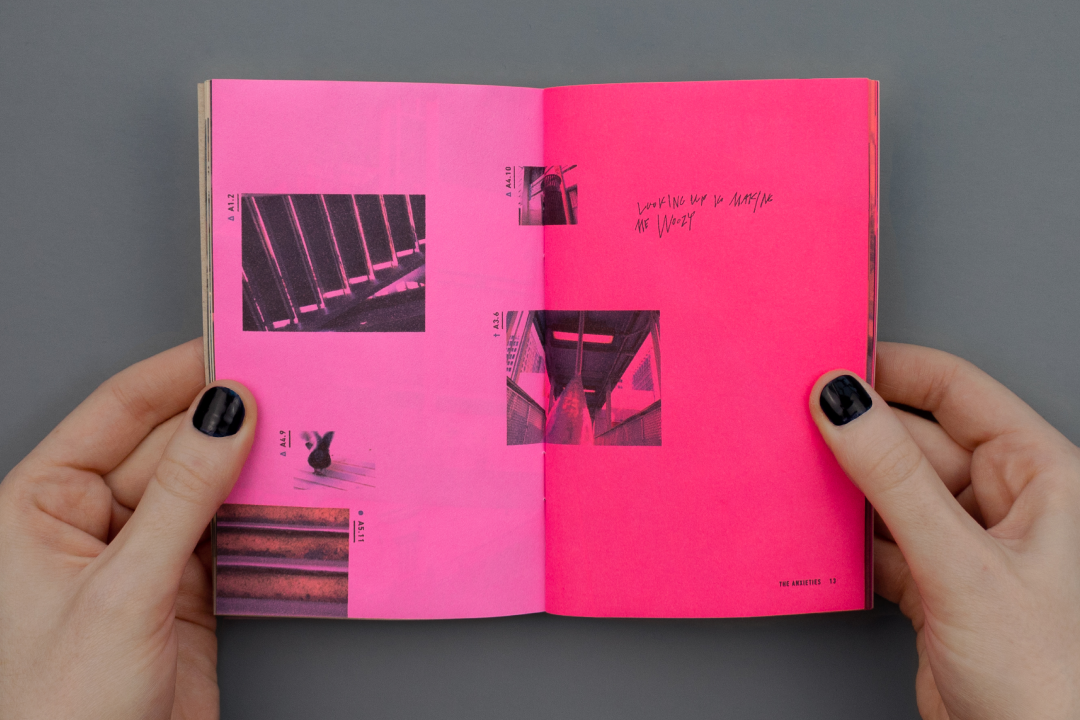
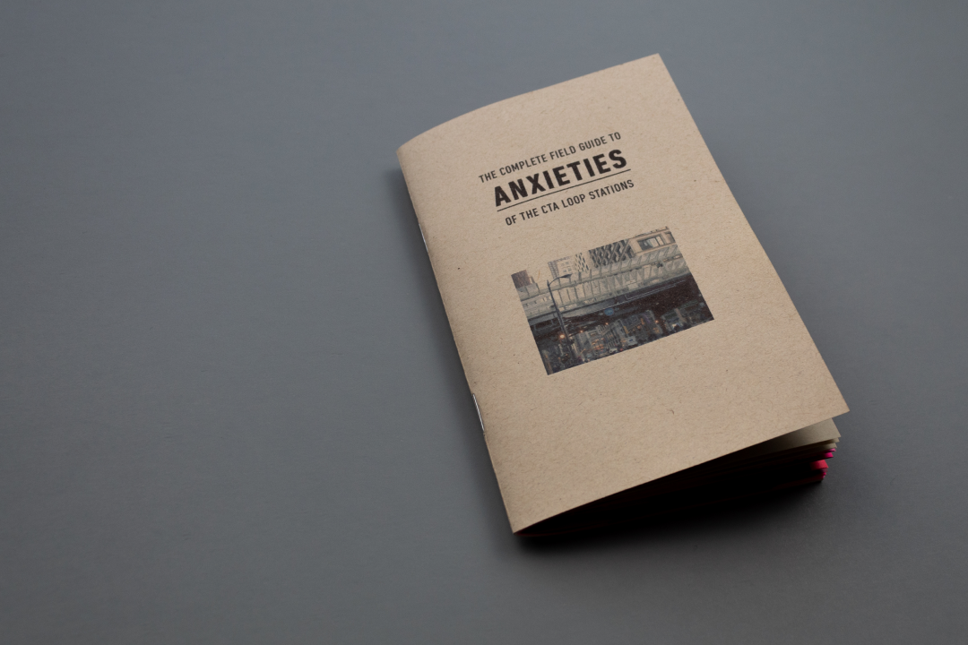
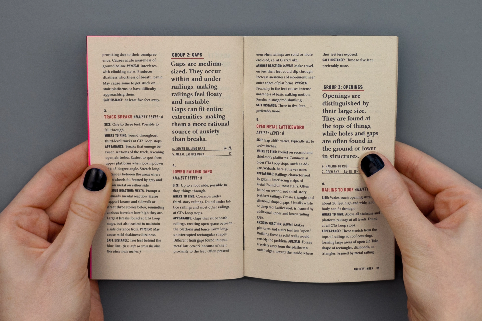
In The Complete Field Guide to Anxieties of the CTA Loop Stations, I document my anxieties surrounding Chicago’s elevated train system, caused by a strong fear of heights.
The first half of the guide contains a photo essay with labeled images that correspond to the index at the back. In the index, each anxiety is described and grouped with similar fears. Group 1: Breaks, for example, consists of Platform, Stair, and Track Breaks.
The Complete Field Guide is held in the Joan Flasch Artists’ Book Collection.

The Beginner’s Guide to Video
Roles: Art Direction, Design, Motion Direction
Client: Designed in-house for Storyblocks
Team: Video production by Kaitlyn Rossi & Kyle Miller, title animation by Superside
Video titles for a YouTube series
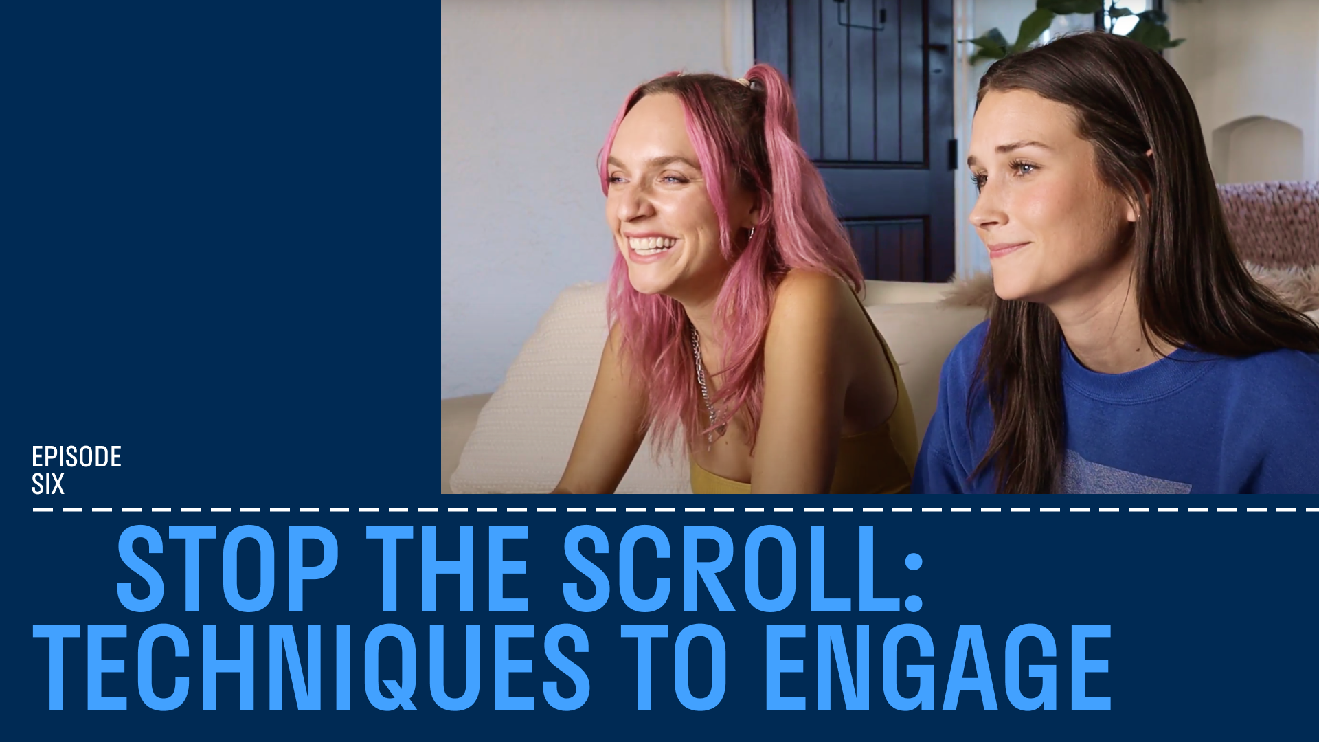
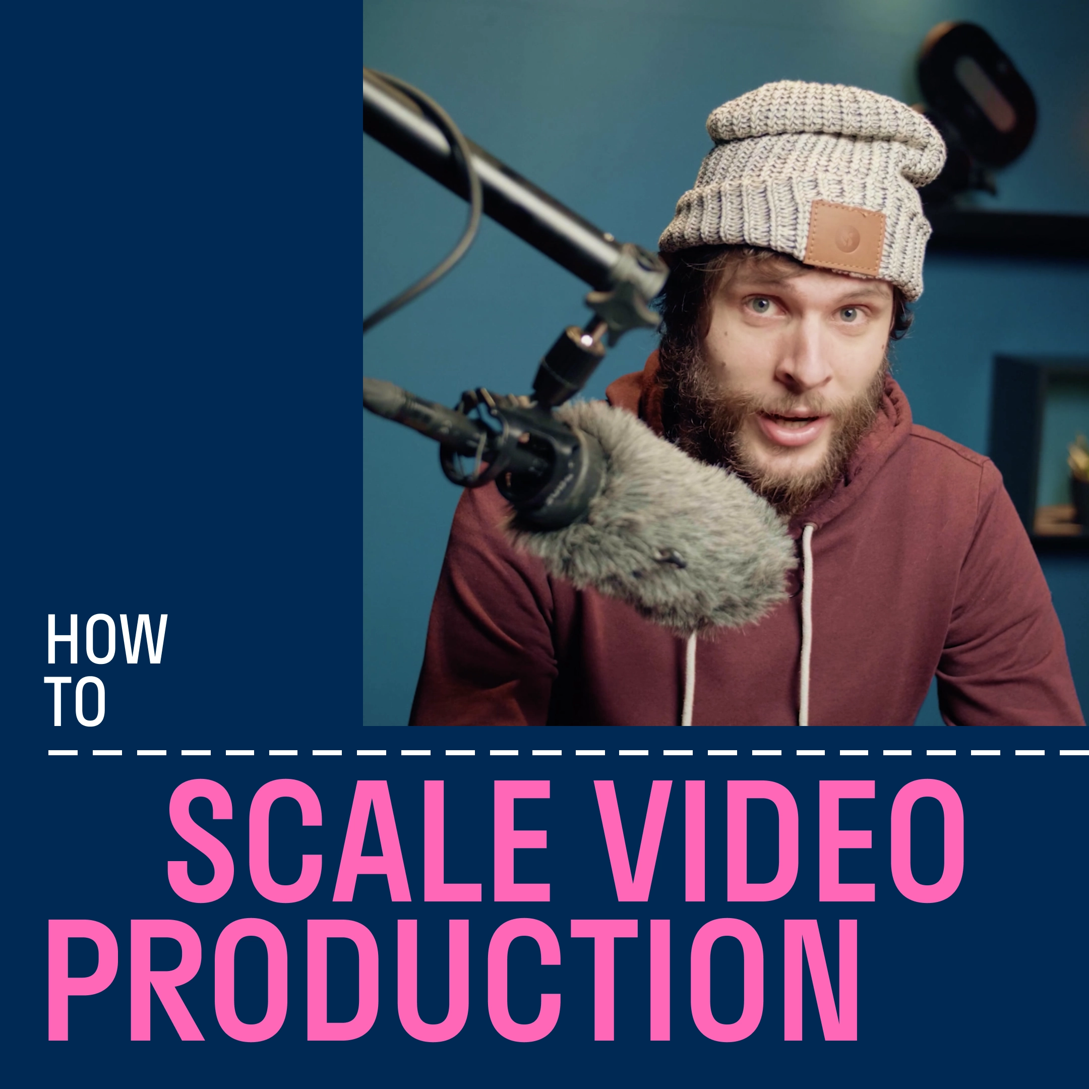
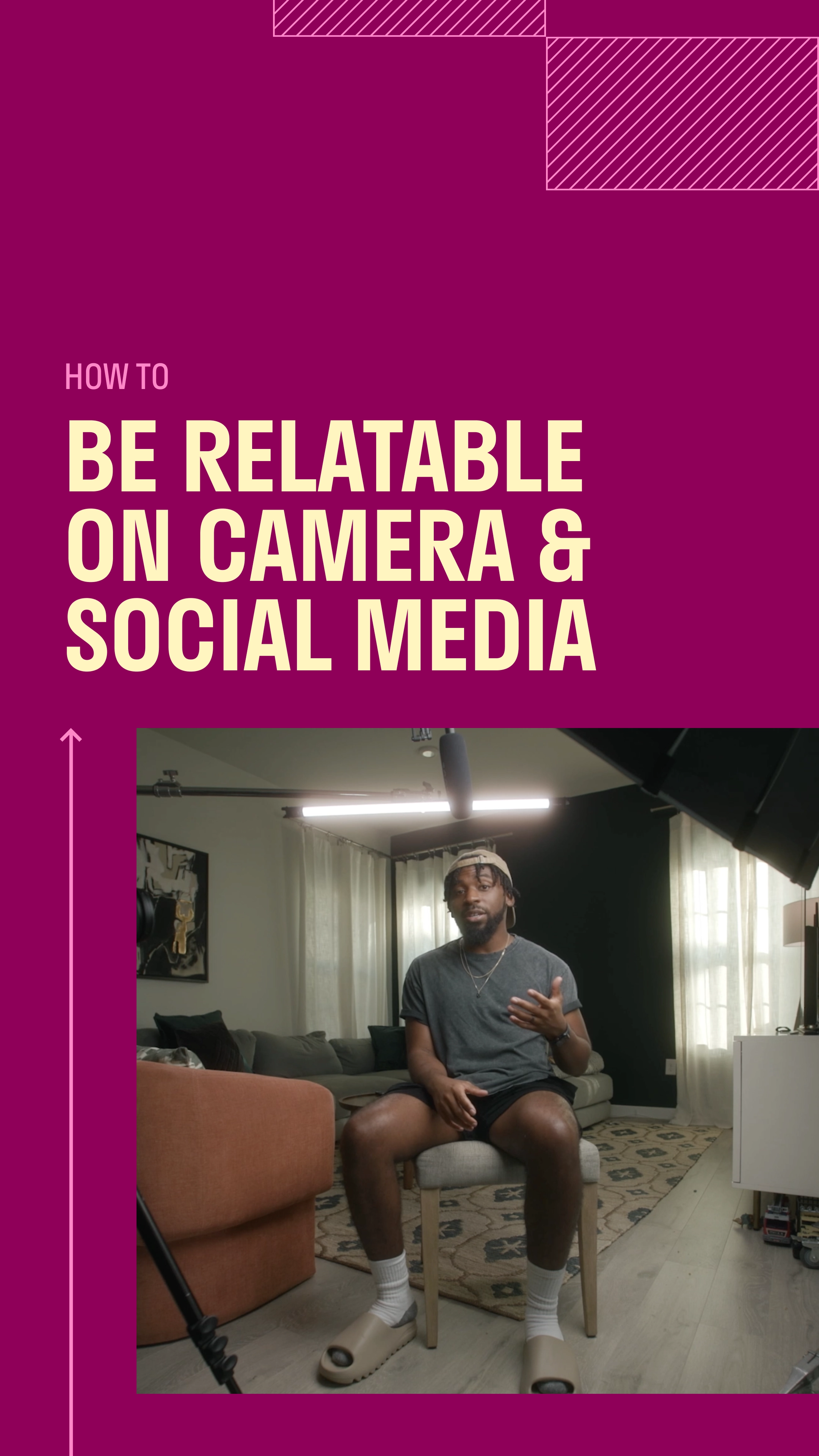
The Beginner's Guide to Creating Video is a YouTube series. In nine episodes, it covers the basic concepts behind video creation.
The series titles use a 16:9 aspect ratio as guiding logic: The 16:9 widescreen is divided into a grid of smaller 16:9 rectangles that offer flexibility to add images, textures, and type.
The intro titles use staggered type to reference video clapboards. Shifting alignment allows the type to precisely fill an invisible 16:9 frame. Stratos was chosen for its structural qualities and mechanical forms, which echo the camera equipment visible in set designs.
Linework recalls basic instructional diagrams to communicate the pedagogical theme of the series.
The United Students of Debt
Roles: Publication Design, Writing
Client: Self-initiated
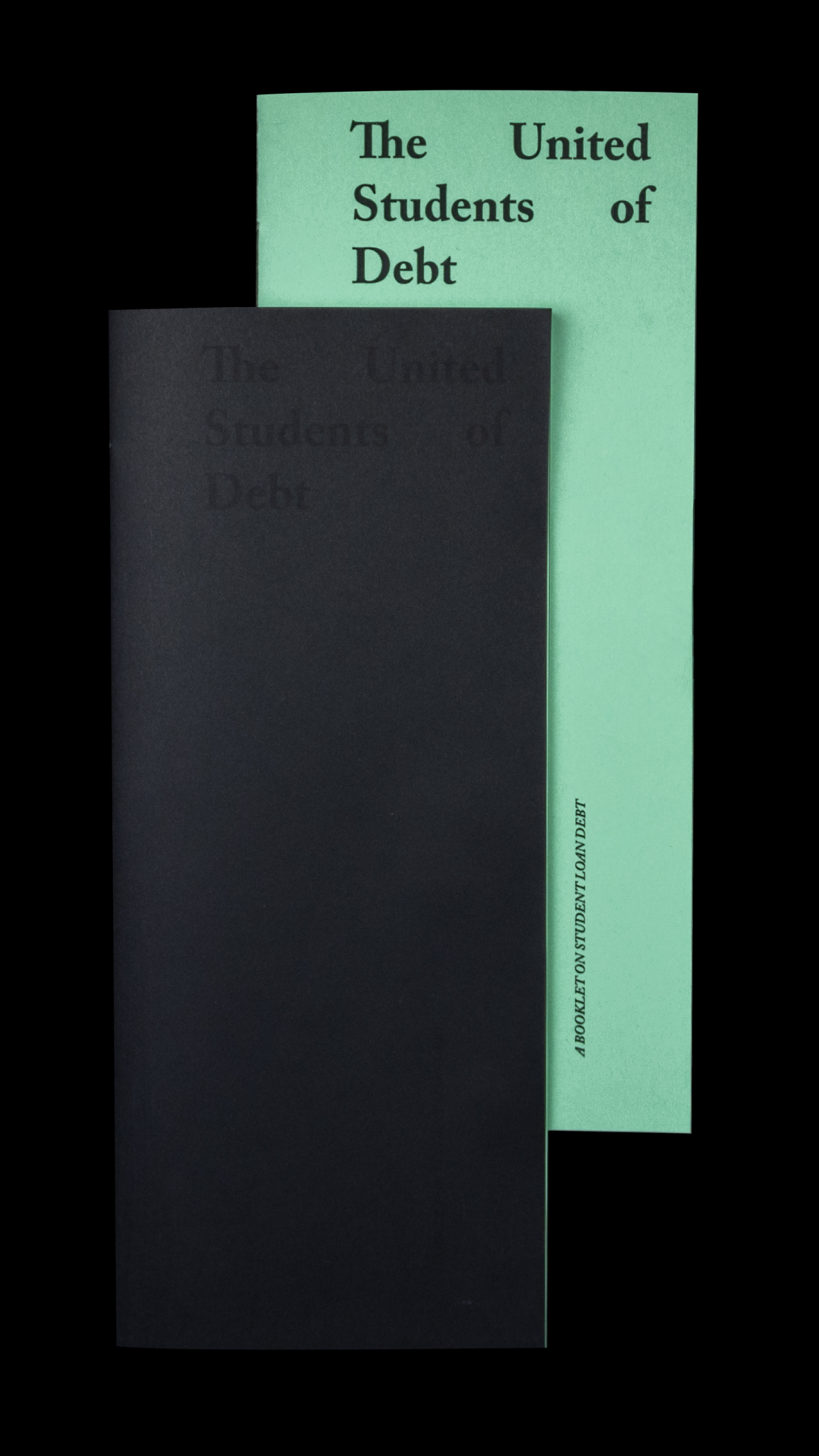
Design for a booklet on student loan debt
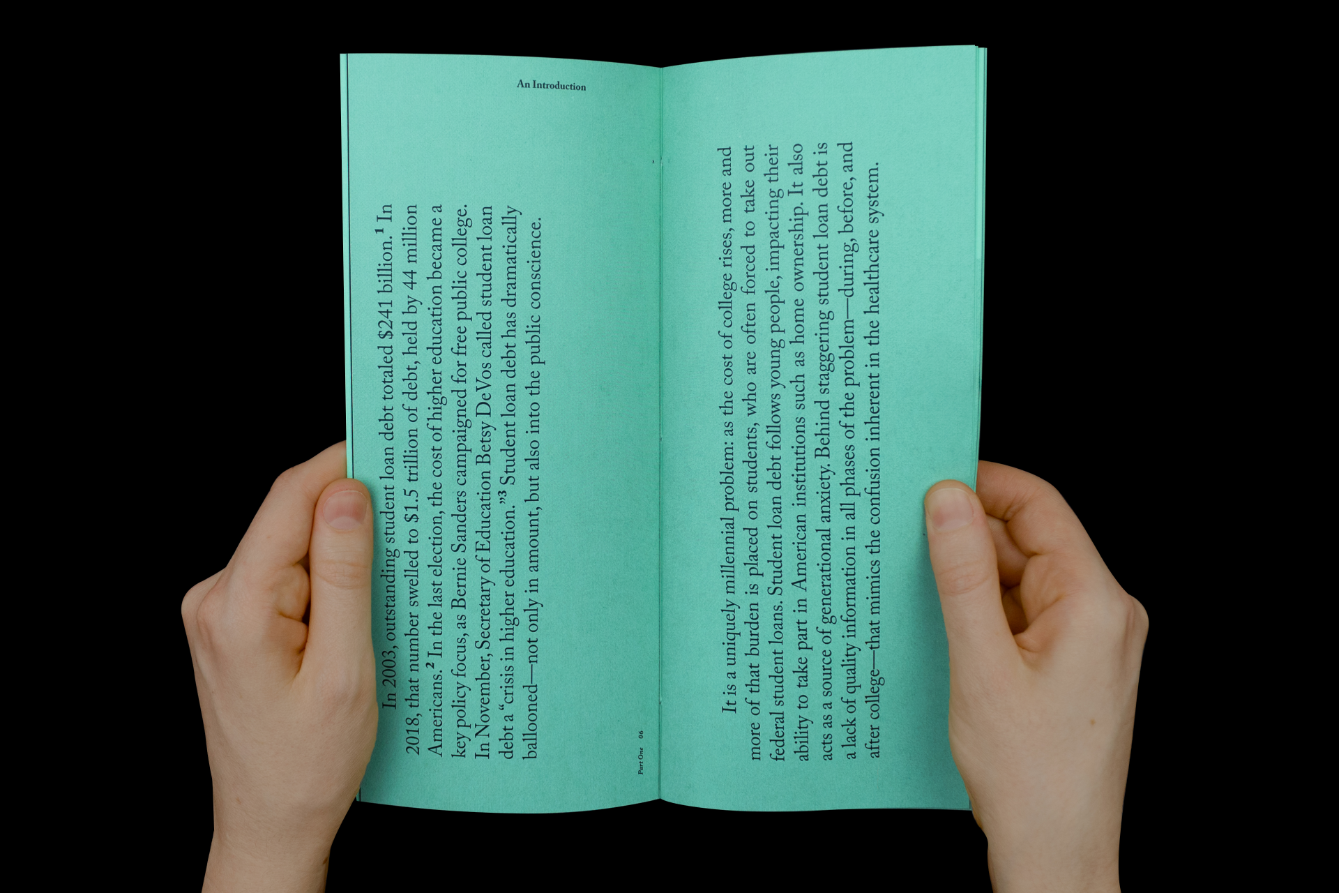
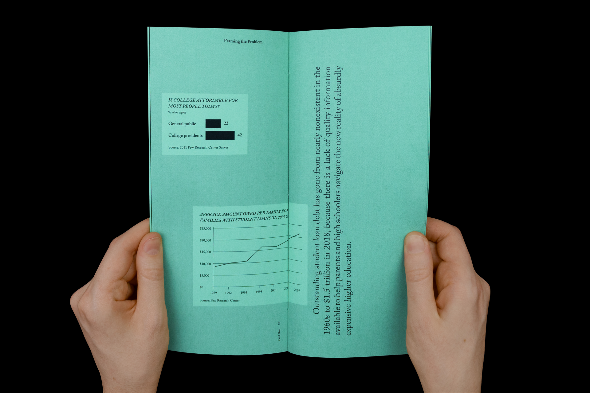
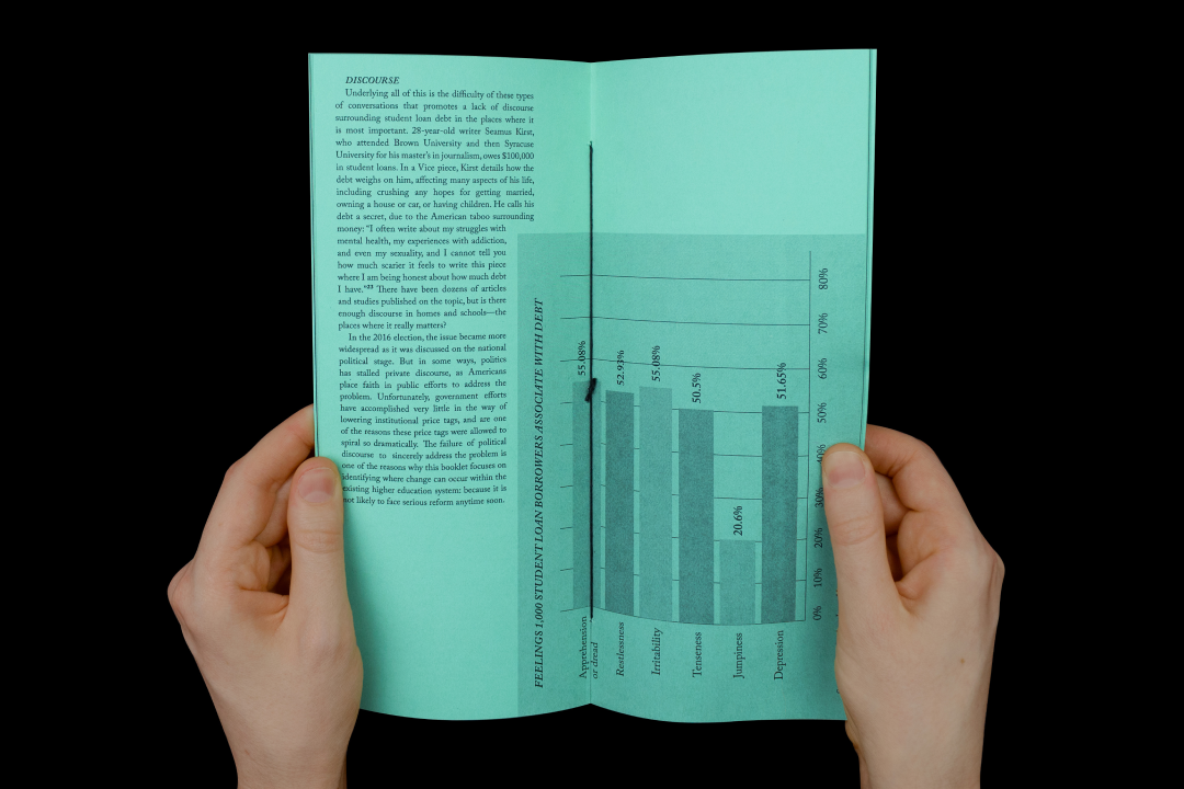
This booklet compiles research on student loan debt. It begins with a broad introductory essay that breaks this complex issue into contributing factors, including ruthless lending institutions.
In Part 2, the booklet narrows its focus to financial aid award letters, which often misrepresent the amount of aid prospective college students will receive. The text highlights the traps in these letters. In doing so, it points back to the absurd cost of higher education.
RATIO Design Monograph
Roles: Publication Design
Client: RATIO Design
Team: Designed at Liska & Associates with Steve Liska
A monograph for the firm’s 40th anniversary
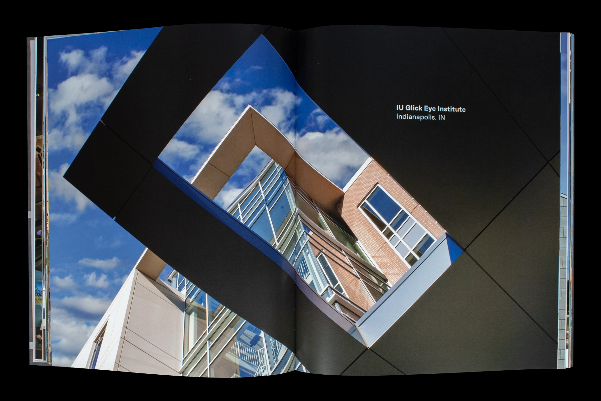
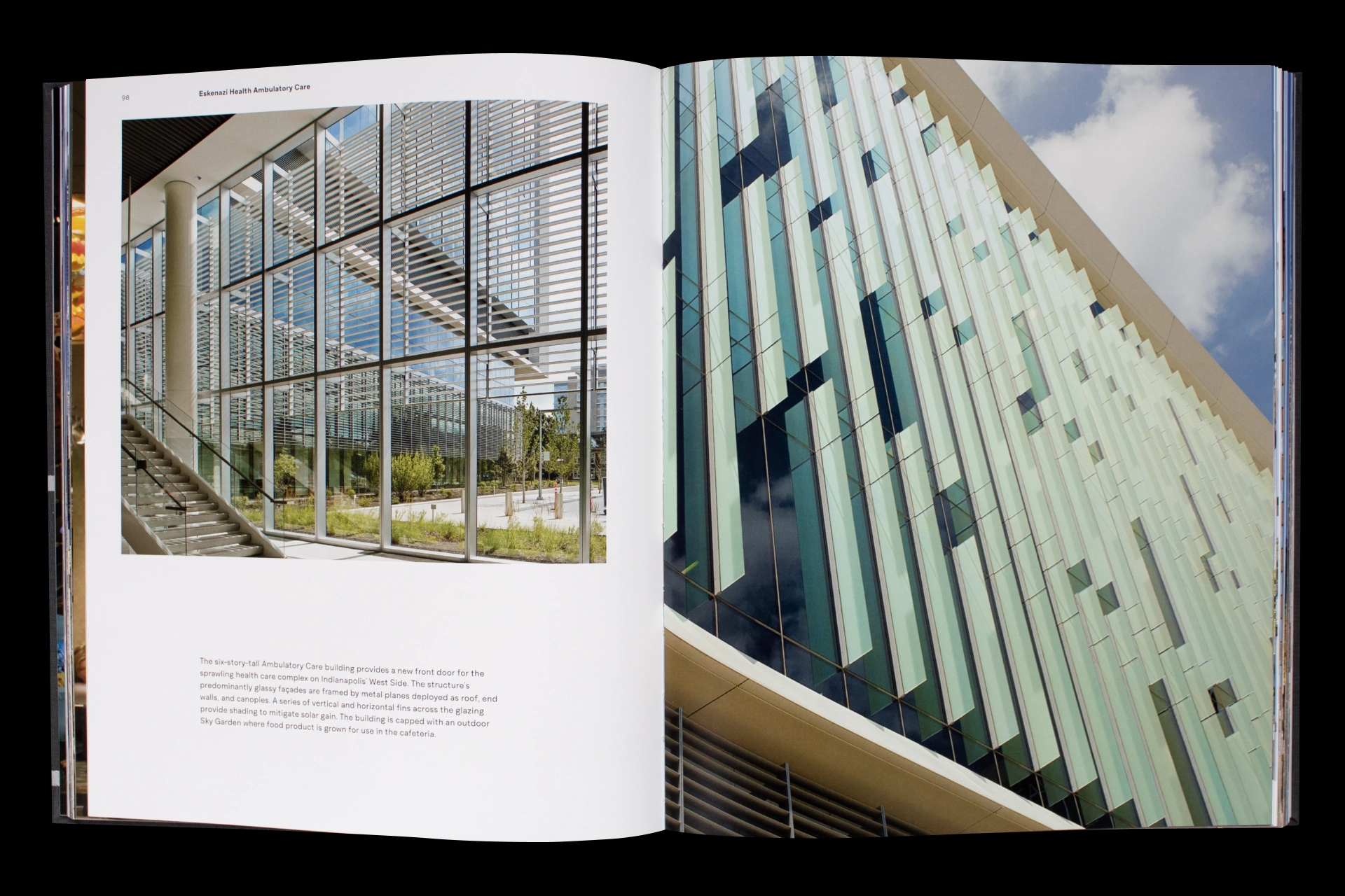
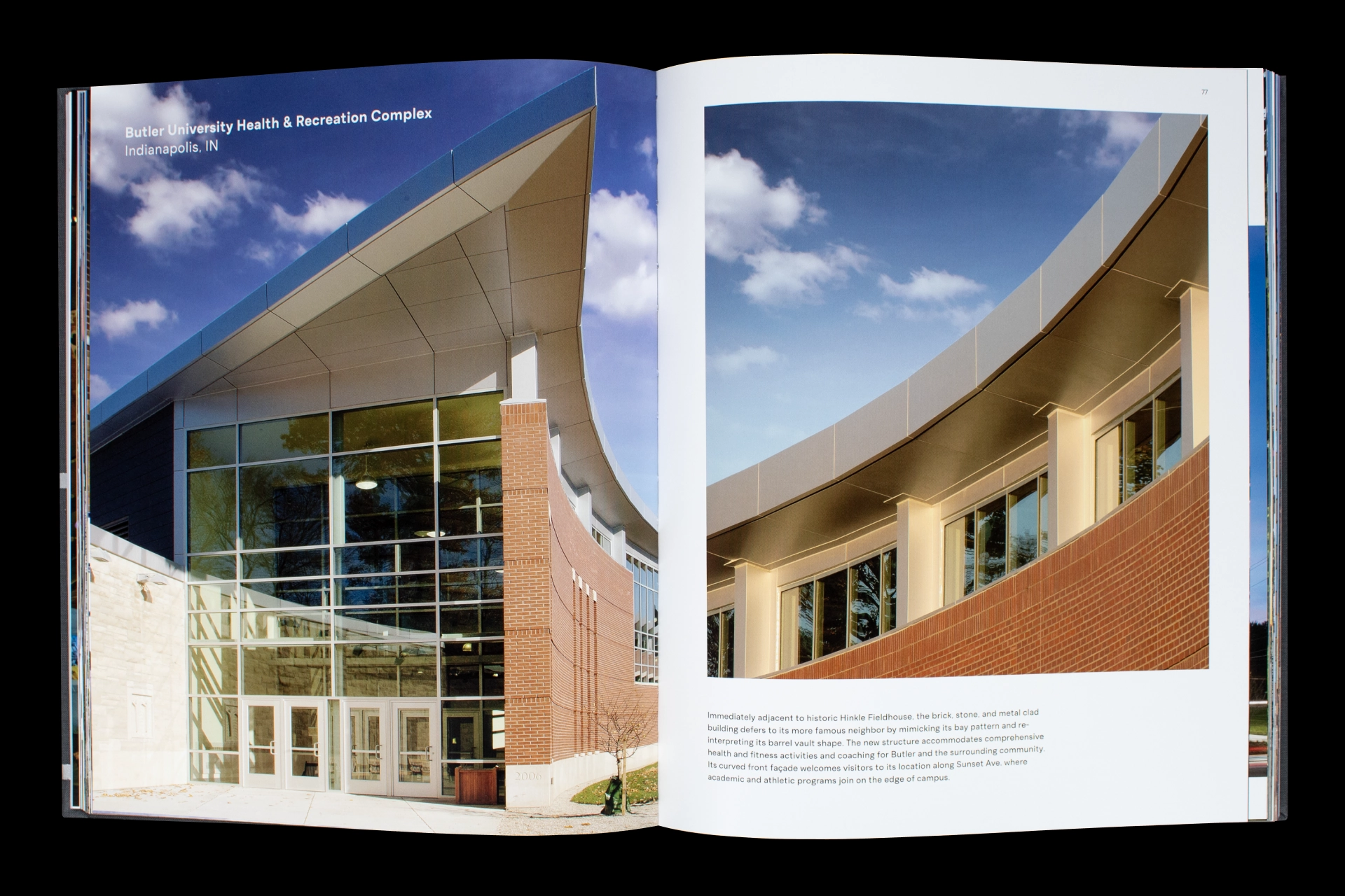
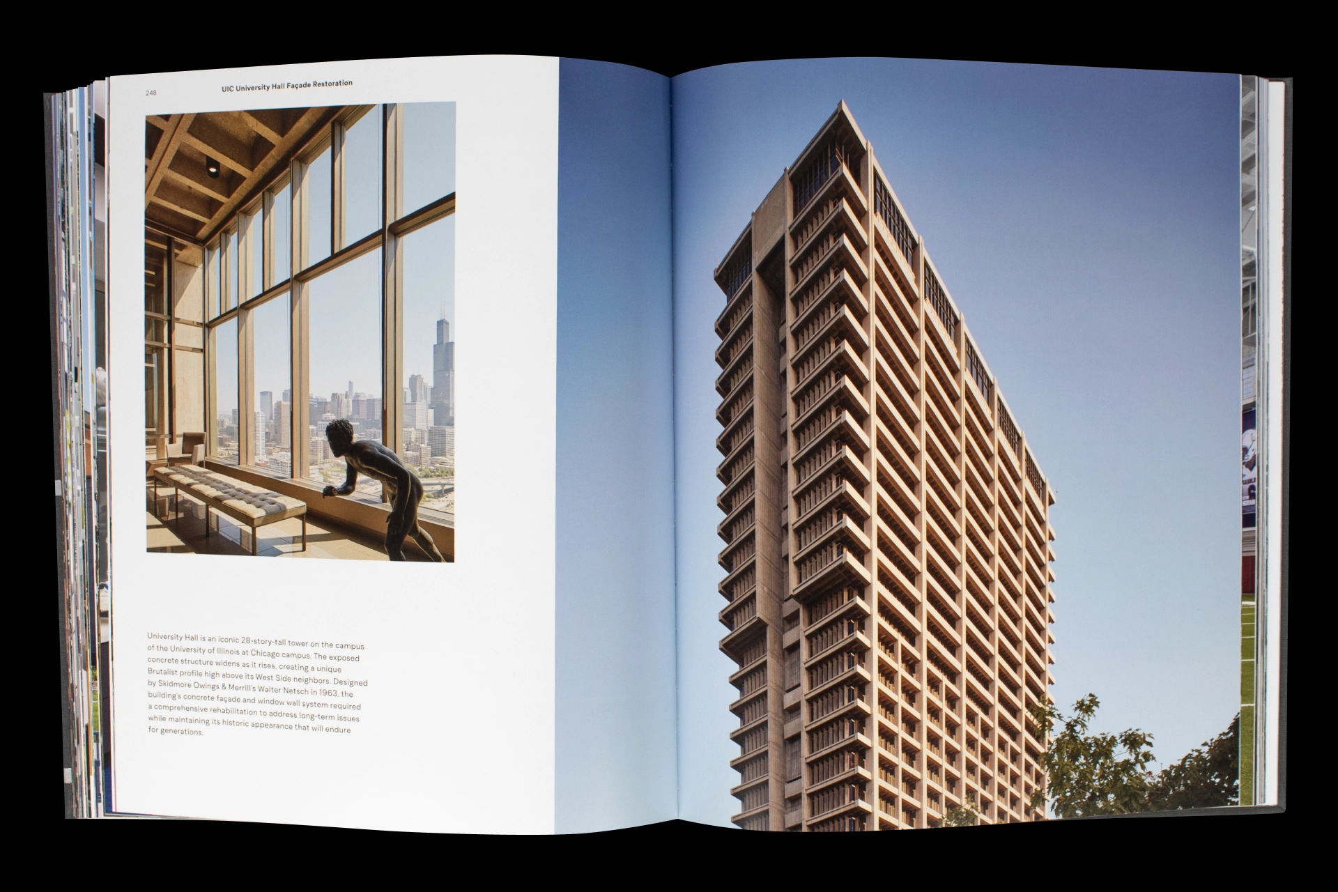
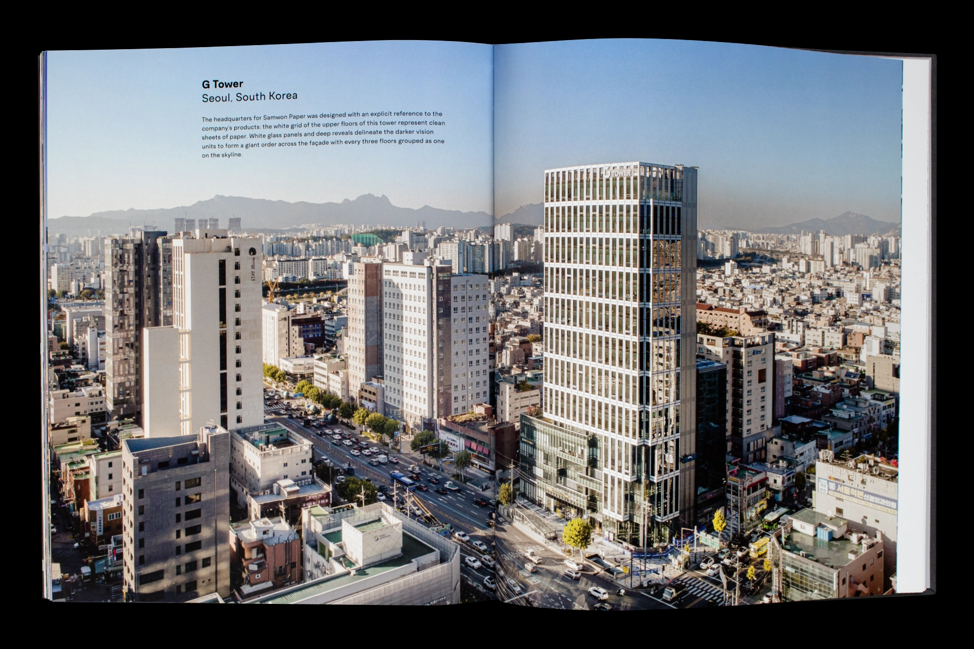
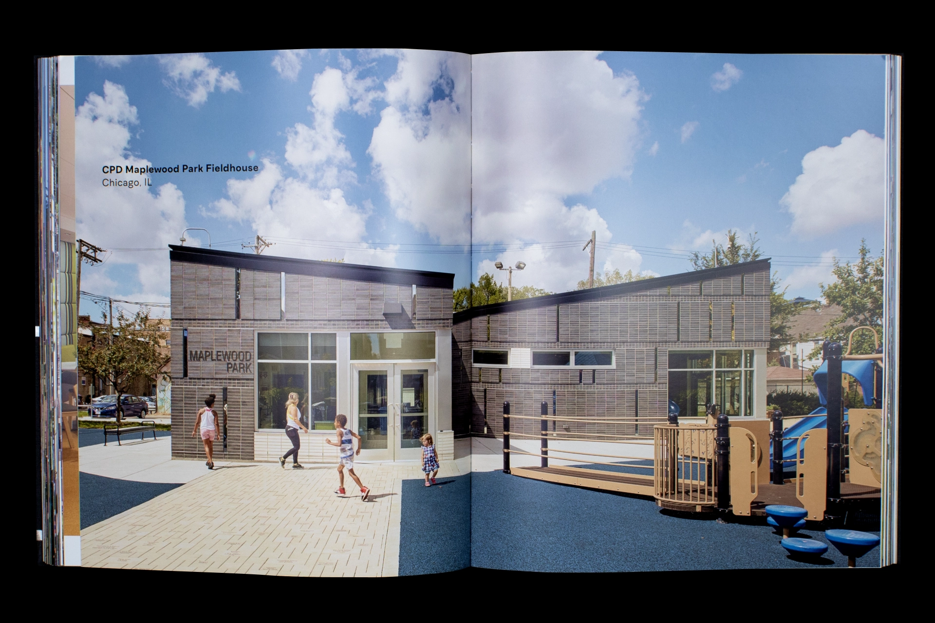
This monograph celebrates RATIO Design’s 40th anniversary and showcases the firm’s global work.
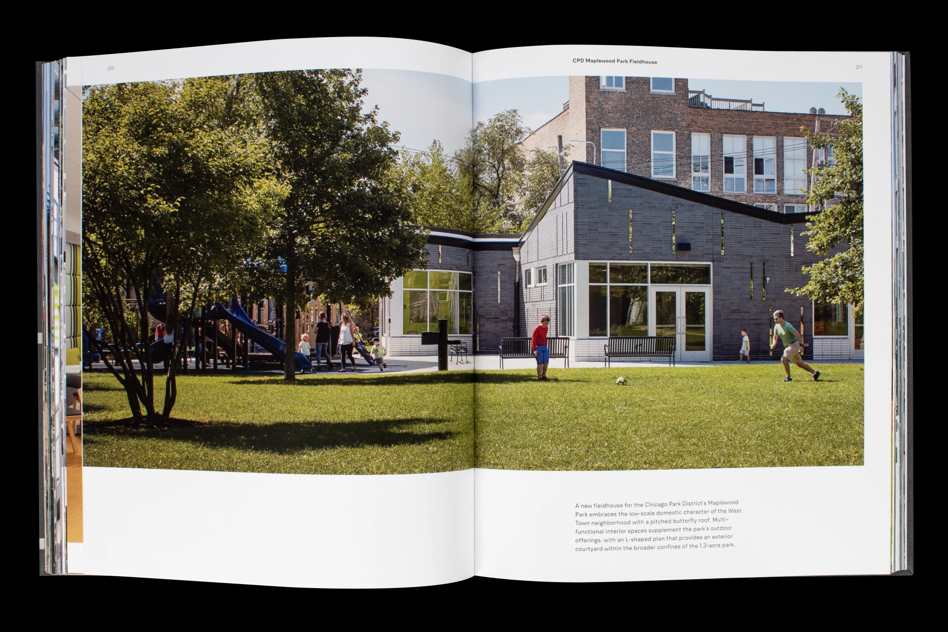
Layouts are driven by simple composition principles: Type is often set to echo the width of a negative space or align with key architectural features.
Photography was strategically curated and juxtaposed to build moments of tension. For example, the swooping roofline of the Health & Recreation Complex at Butler University extends across two facing images: The two roofs strain to connect, but are slightly offset, engineering a jump cut that subtly reinforces the filmlike drama of design and building.
Video Strategy Guide
Roles: Editorial Illustration
Client: Designed in-house for Storyblocks
Team: Creative direction by Kaitlyn Rossi, writing by Bani Kaur, copy editing by Valerie Shore, strategy by Gia Marando & Emilia Korte
Editorial graphics and worksheets
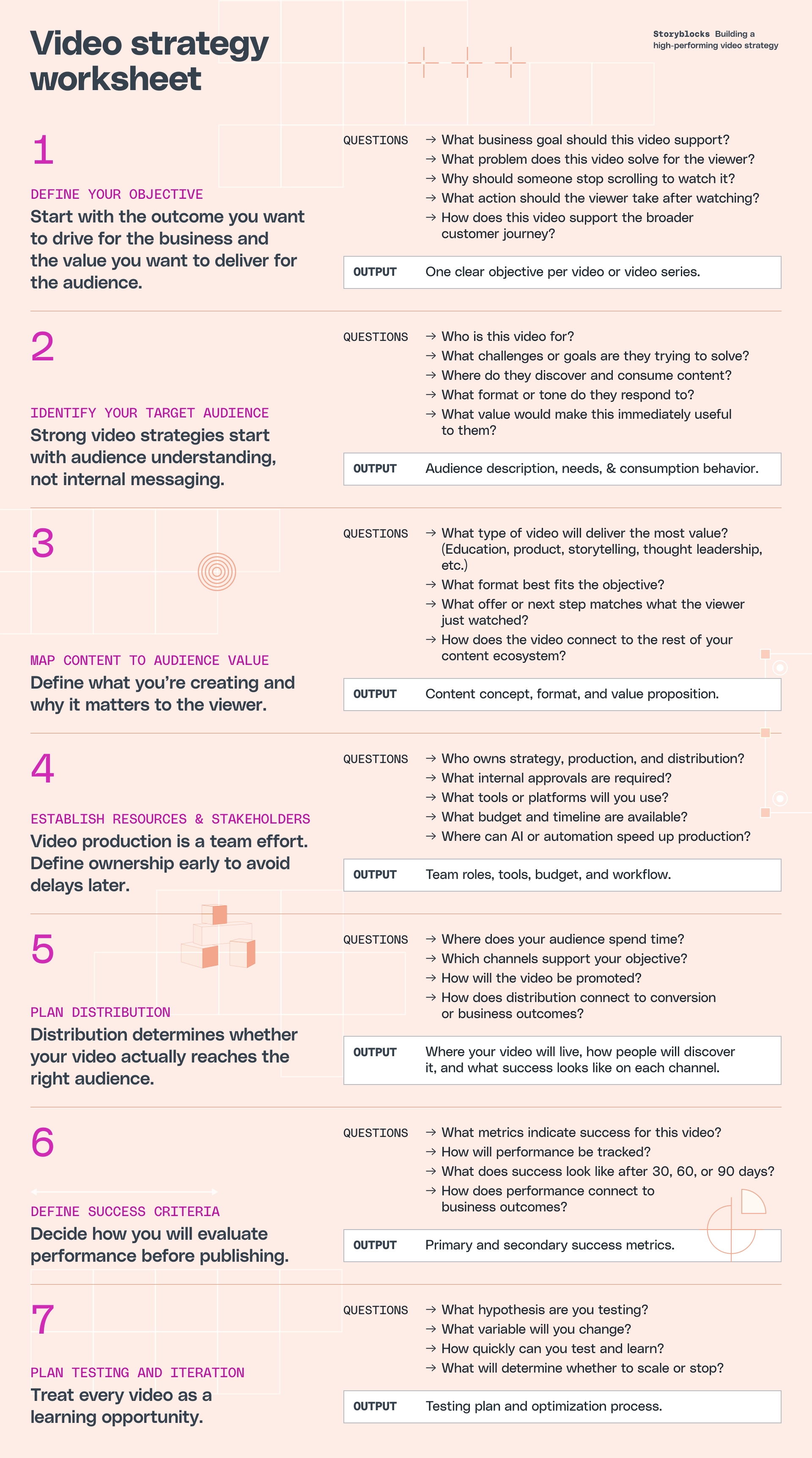
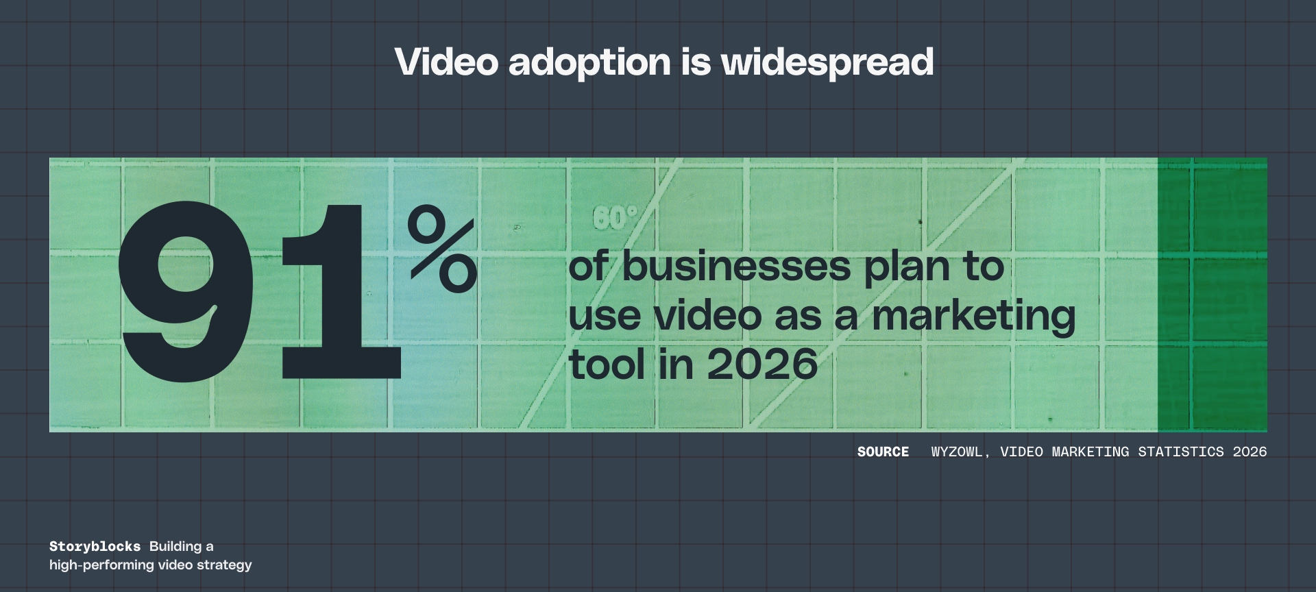
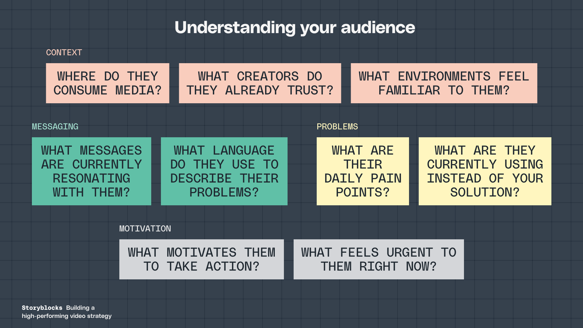
The Practical Guide to Building a Video Strategy is an encyclopedic article that covers everything you need to know to build your own strategy.
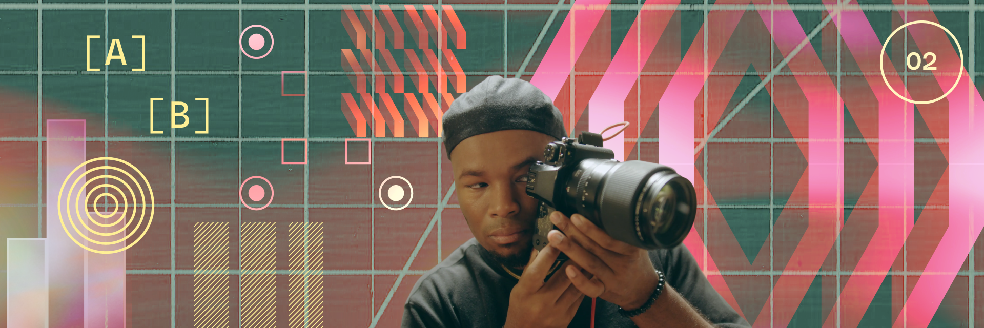
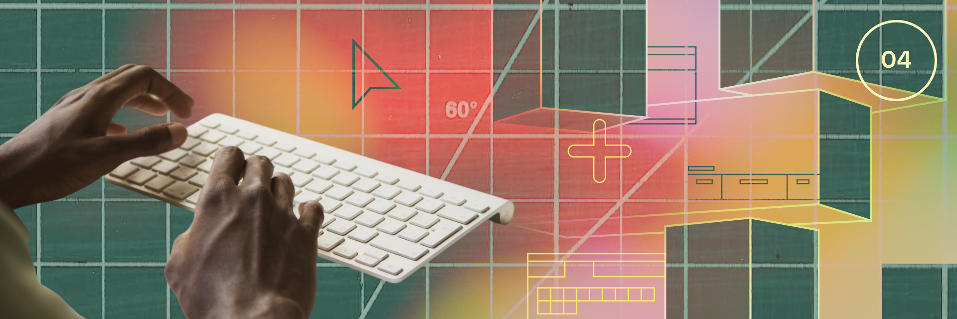
Video strategy is naturally articulated through language and numbers: Written objectives or data, for example. I was interested in exploring what this written world might look like if it were a 3D, visual “place.”
I started by producing a wide range of vector drawings that related to video. I then used layers and digital compositing as a tool to interrupt these structural vectors: For example, images of light leaks are blended onto vector drawings, causing them to unexpectedly disappear or recede.
The element of chance was important in the design process. Part of the process involved overprinting random combinations of drawings and imagery to discover unexpected interactions.


Intro to Viscom course website
Roles: Site Design, Front-End Code
Client: SAIC
Site for a class I taught at SAIC
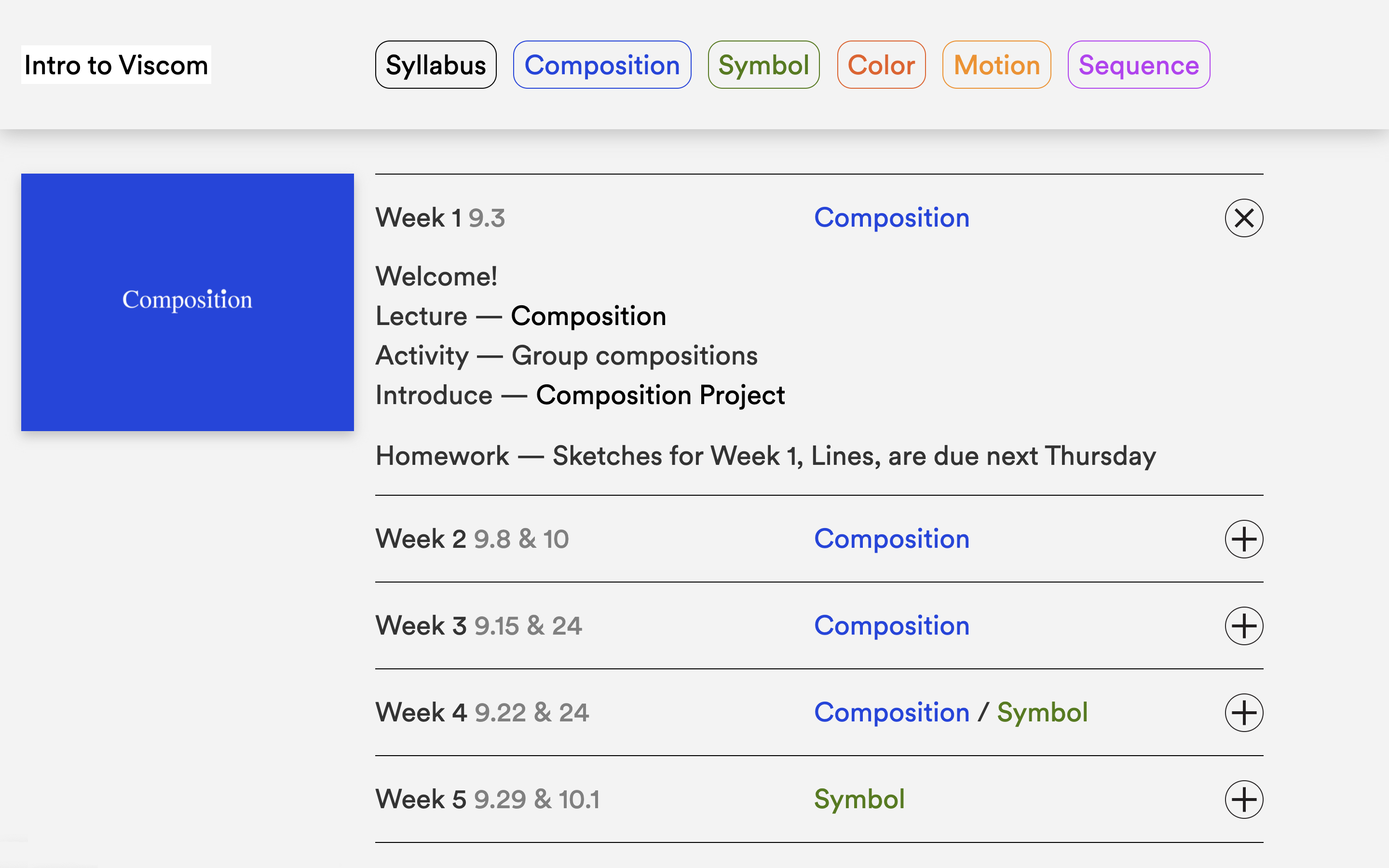
In Fall 2020, I designed and developed a website for my Introduction to Visual Communication students at School of the Art Institute of Chicago. The site served as an anchor point where the class could access course materials.
Clear and intuitive organization was critical as COVID produced uncertainty, especially for students attending their first semester of college. The homepage features a weekly schedule to keep students focused. Content is organized around the course’s five units, each designed to cover a core principle in visual design.

Dream Books
Roles: Publication Design, Writing, Illustration
Client: Self-initiated
Design for four artist books
This project began with dream research: How do our brains behave during dreaming?
I then incorporated research into a writing experiment. The experiment’s constraints reflected the properties of dreaming. For example, our dreams often sample and repeat content from our daily lives. Thus, one constraint collected content from my Spotify account: “Write down the title of the last eight songs you listened to. Each title must be repeated twice in the story.”
The writing experiment produced 10 short stories that I designed into book form.
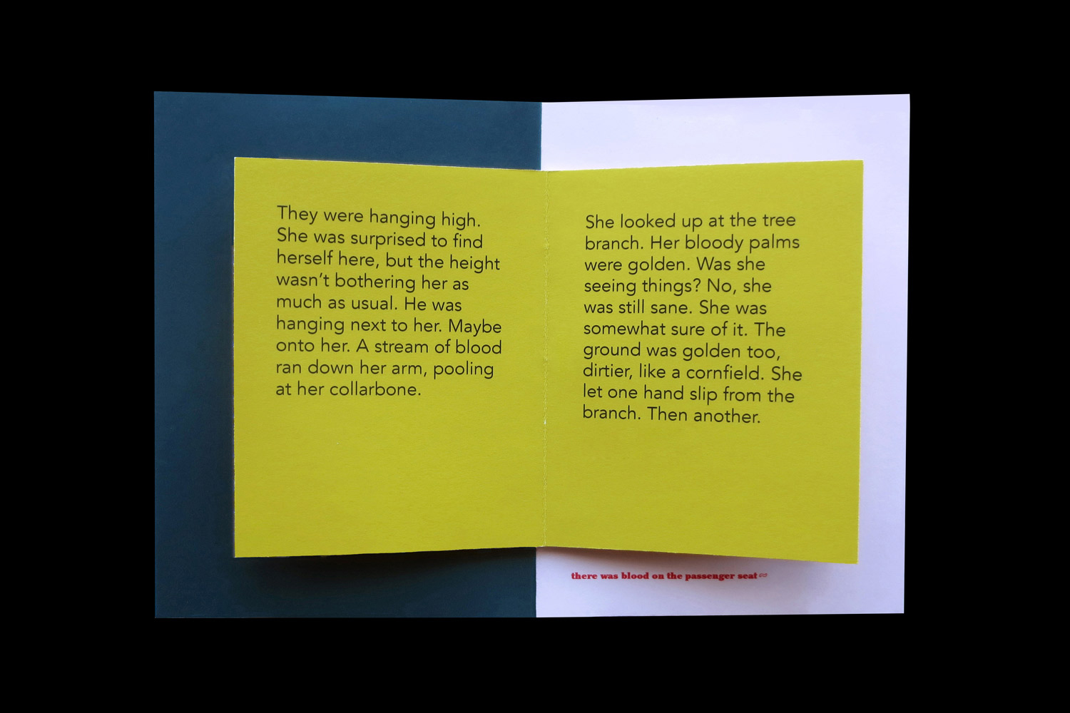
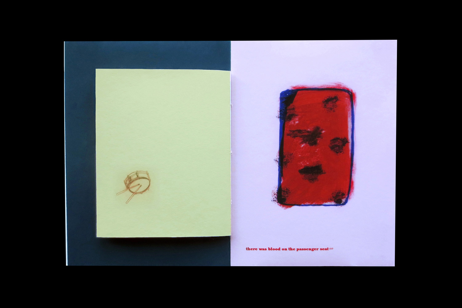
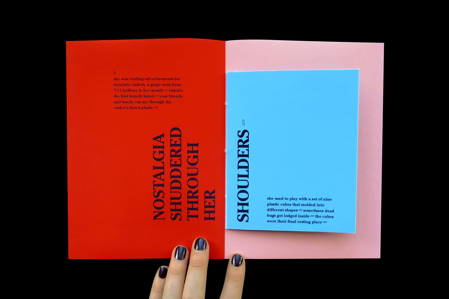
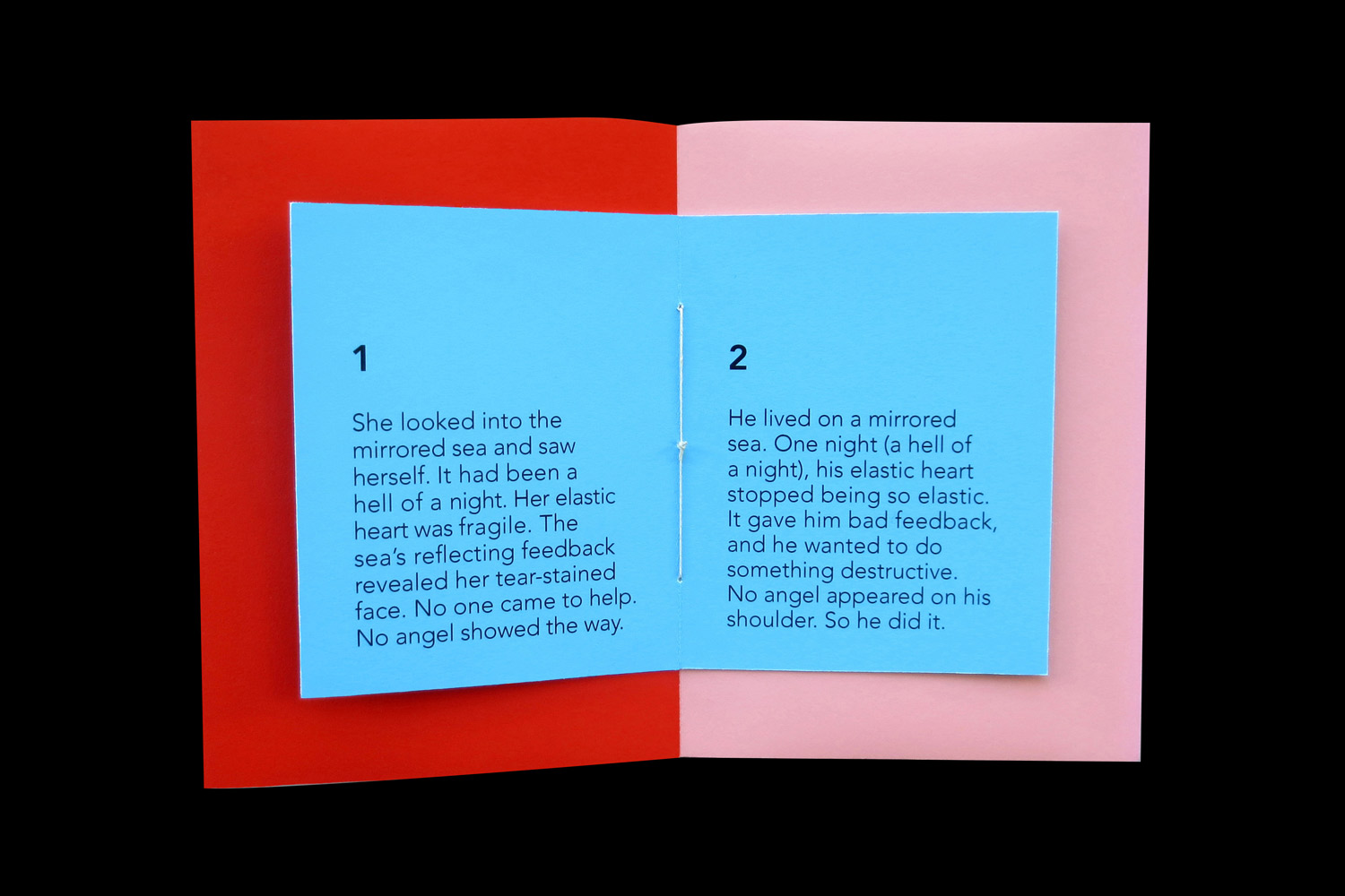
Smaller books, sewn into the larger ones, serve as interruptions in the main sequence. This strategy captures the arbitrary nature of dream narratives, specifically how they transition fluidly between unrelated scenes.
Smaller books also build a multichannel experience where readers encounter two stories simultaneously on a single spread.

The 2025 Video Trends Guide
Roles: Publication Design
Client: Designed in-house for Storyblocks
Team: Creative direction by Kaitlyn Rossi, writing by Valerie Shore, strategy by Gia Marando & Emilia Korte
Digital publication on the future of video creation
The Video Trends Guide explores the future of video in 2025.
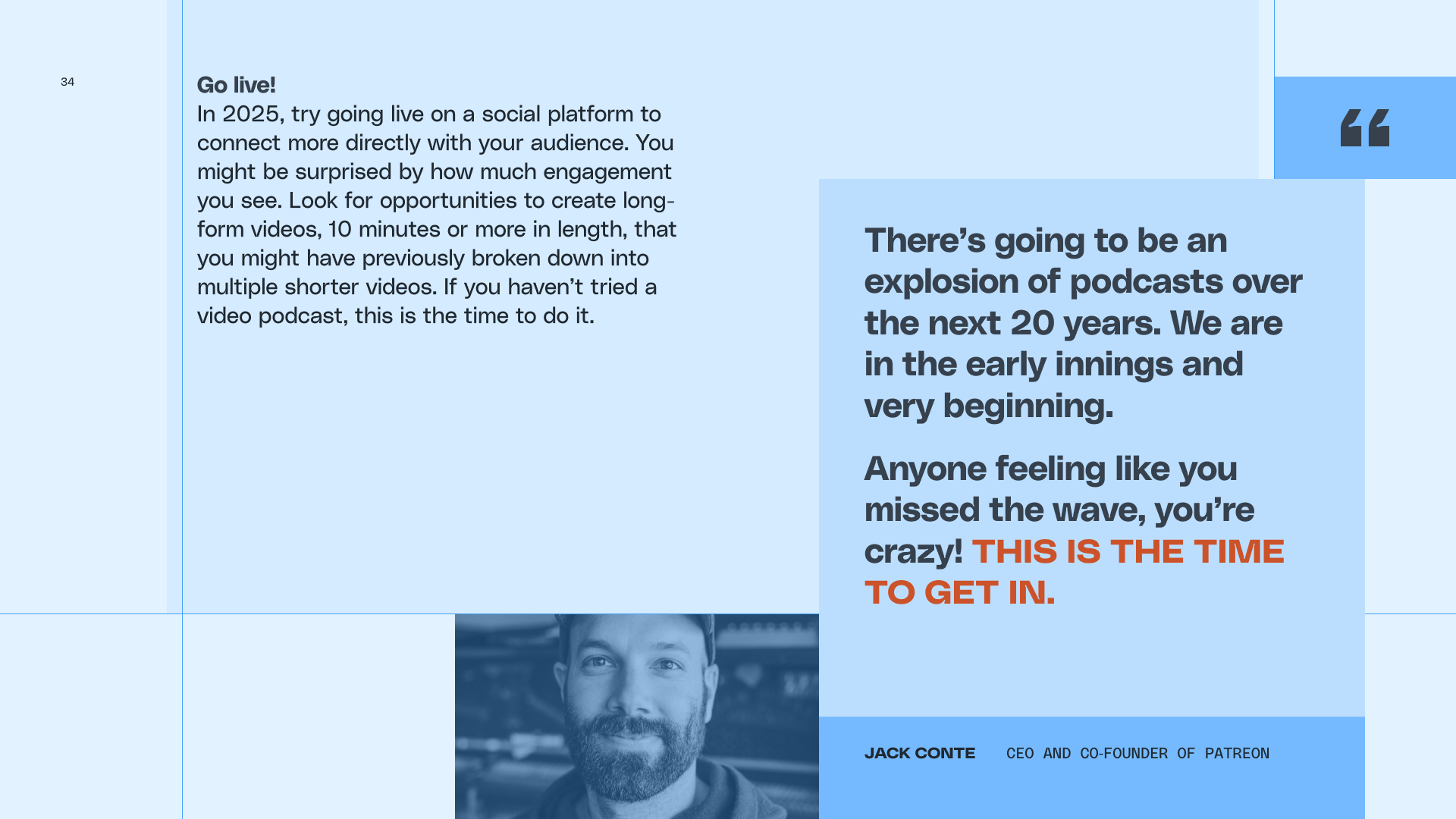
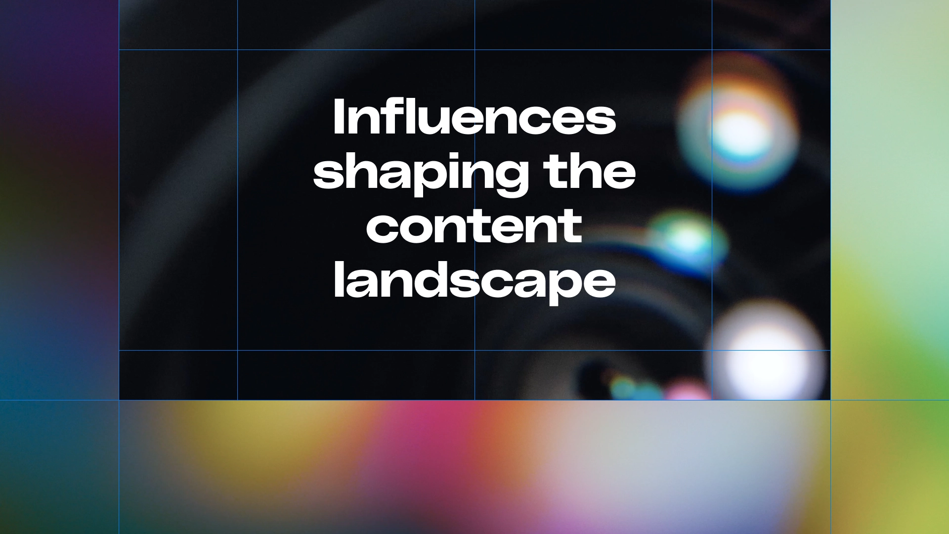
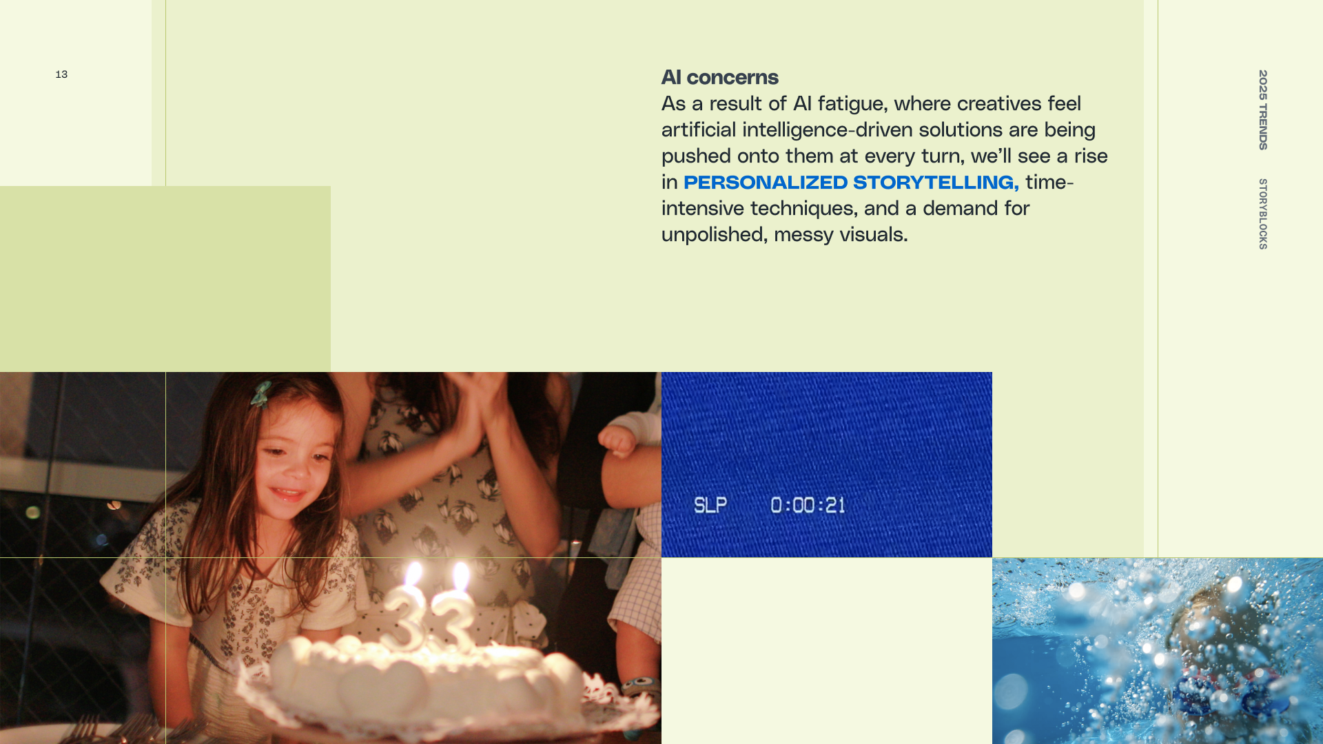
Designs use the grid overlaid in camera viewfinders as a compositional device to produce collages and architectural image stacks.
This gridded approach echoes the guide’s key predictions including the seismic, foundational shifts produced by new AI tools.